Toast Kitchen + Bakery
Packaging and Branding Redesign
Rebranding an already lively and popular brunch spot better reflect their ideal brand image!
*Not in affiliation with Toast Kitchen and BakeryTimeline: September-October 2023
Role: Brand Strategist, Graphic Designer
Problem
Toast Kitchen and Bakery is a fresh and trendy restaurant with locations in Costa Mesa and Tustin. They deliver a hip and lively brunch experience but are missing key branding elements that help tell their story.
Solution
In this branding redesign, I tackle multiple elements of their business to help convey their energy and essence to customers before, during, and after their experience at the restaurant.
Research
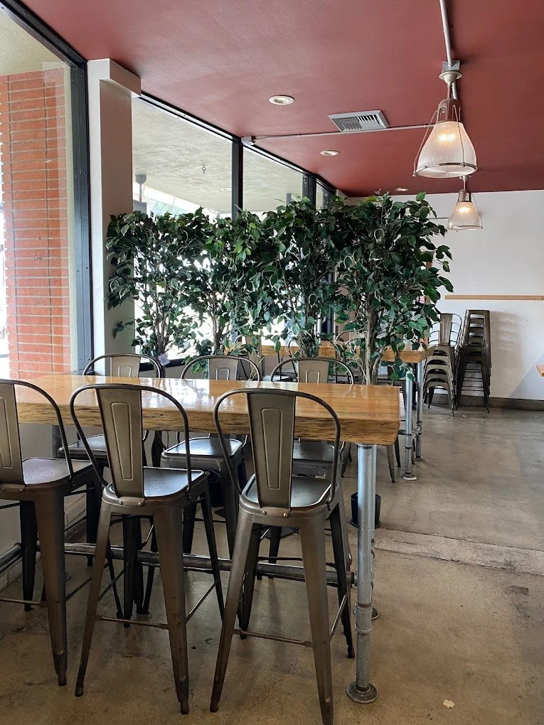
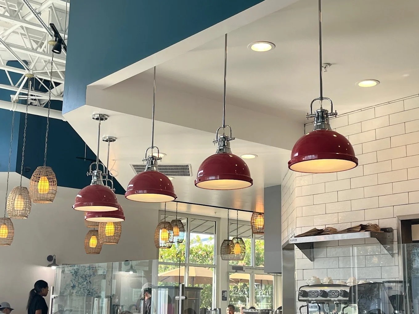
Toast Kitchen and Bakery has 2 locations, the original restaurant in Costa Mesa and the newest location in Tustin.
The design for the Costa Mesa location features a darker color palette of charcoal, brick red, and grey and maintains a cool and laid back vibe.
The design for the Tustin location is a clear contrast to its sister and primarily utilizes a color palette of cream, blue, and fire engine red. The space feels open, bright, and lively in contrast to its partner’s easygoing persona.
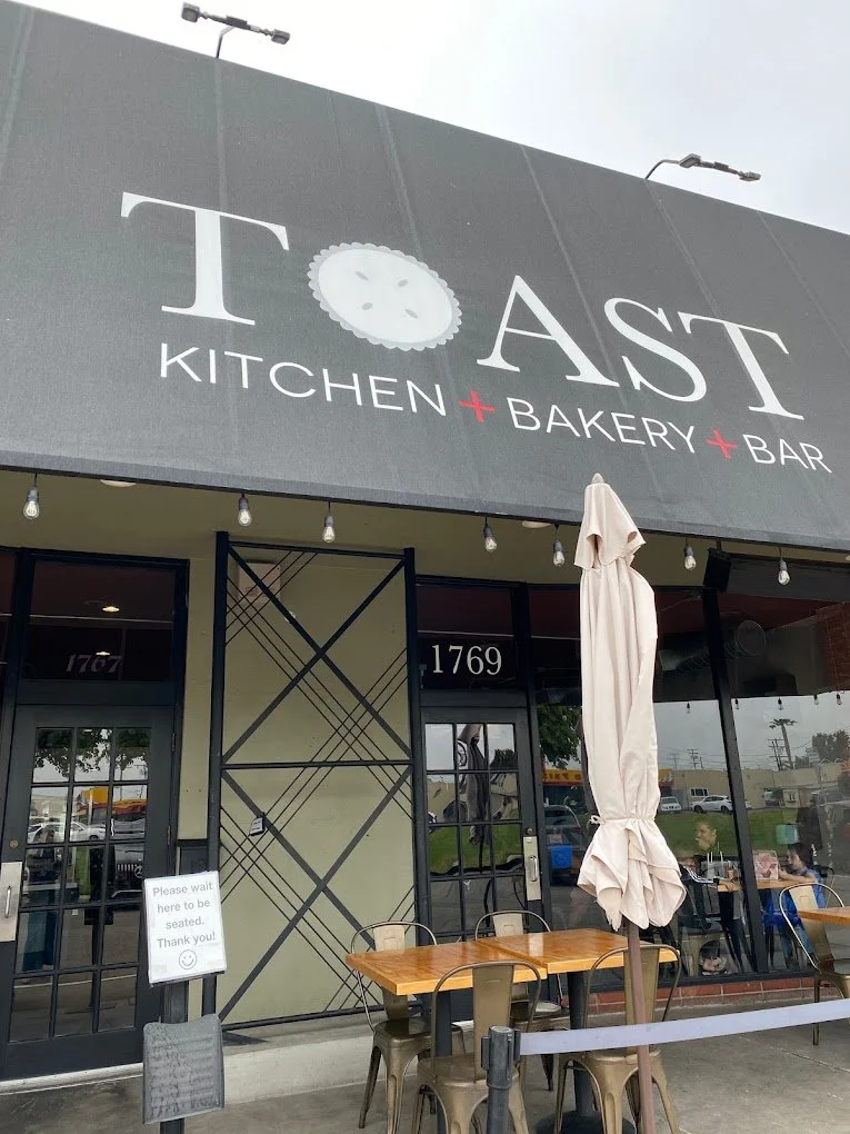
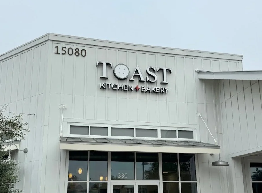
Current Branding
Logo
#FFFFFF
#C92828
#808281
#2C2C2C
Color Palette
Branding Changes
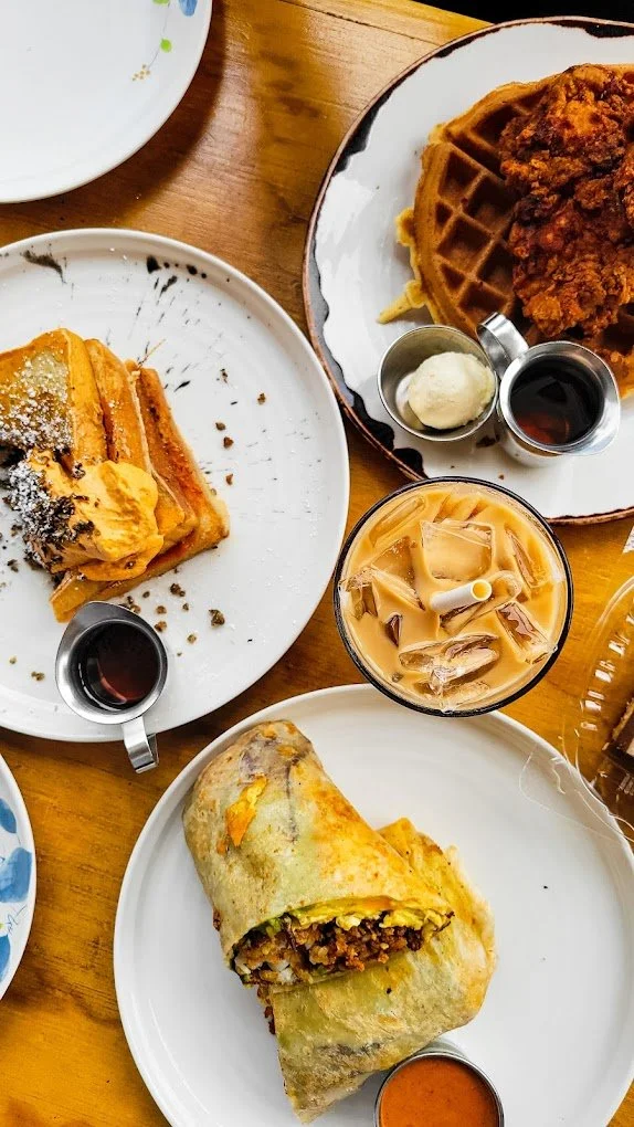
Toast Kitchen and Bakery deliver vibrant, creative and modern dishes, all of which appeal to their specific customer base of young and hip Gen Z and millennials.
However, their logo and branding lacks that same energy, youthfulness, and unique quality that they present in photos and in person. Their logo also includes a pie as the ‘O’ since they originally started out as more of a traditional bakery but have since transitioned to mostly brunch. The ‘O’ is not easily identifiable as a pie unless it is pointed out to its audience first.
With this rebrand, I want to shift their color palette to include more bright colors, creating continuity between their brand and their food. I also believe that soft and refreshing branding will work well for a brunch restaurant appealing to the youth.
Rebrand Goals
Showcase their elevated and trendy dining experience through the use of color, type, and illustration across all restaurant branding
Develop a logo and variations that align with their brand identity
Create enticing packaging for their made in-house drink line
Ideation
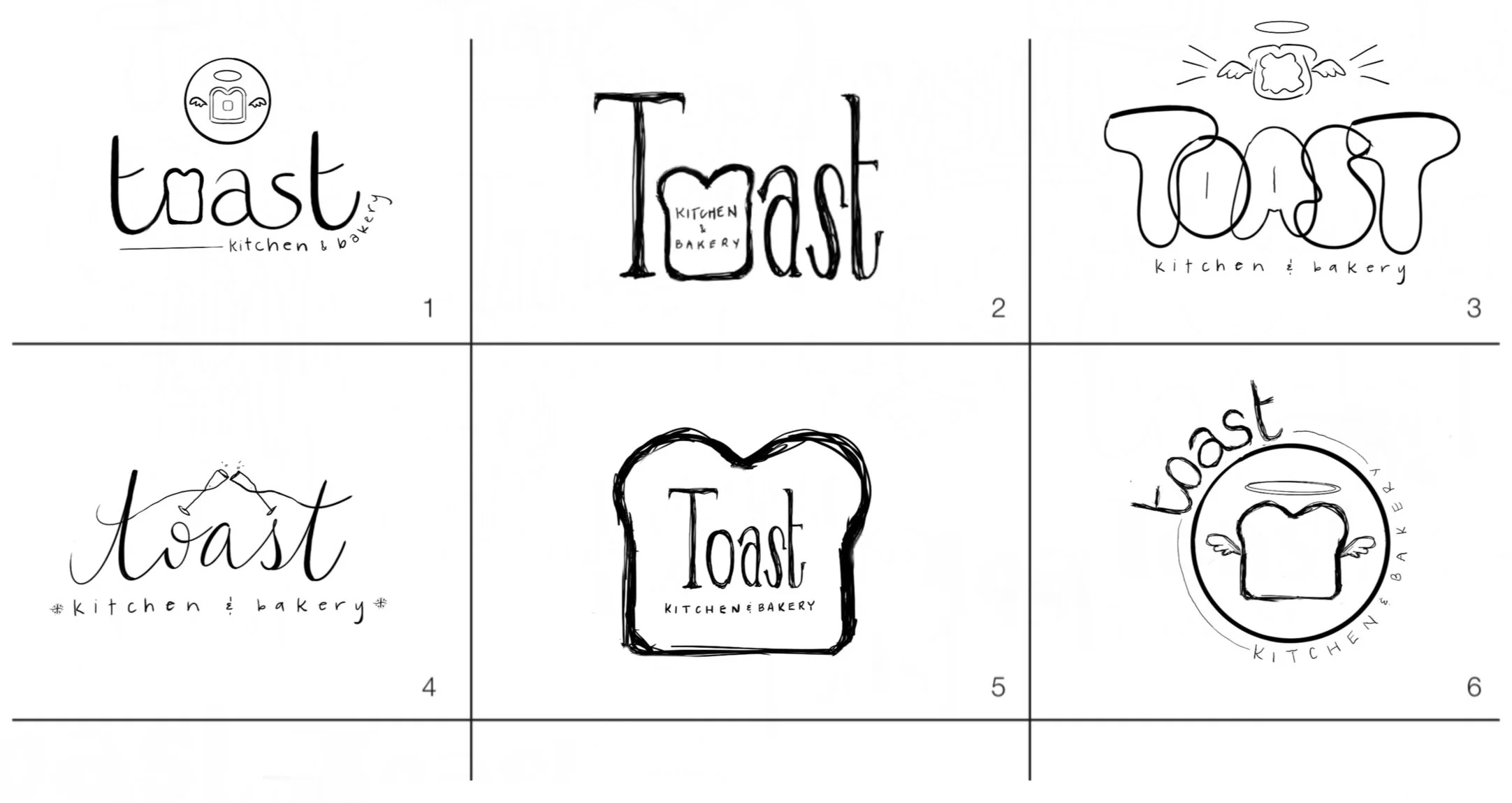
Logo
Based on the interior, menu, and ambiance of Toast’s restaurants, the ideation sketches reflect both locations’ ambiance, with some of the logo sketches being either fun, bubbly, and youthful OR elegant, classic and sophisticated OR some being a combination of both.
Packaging
These two design directions reflect both ambiances, the top design is more classy and clean while the bottom design is bubbly, youthful, and refreshing. I decided to pursue the latter design to appeal to a younger audience.
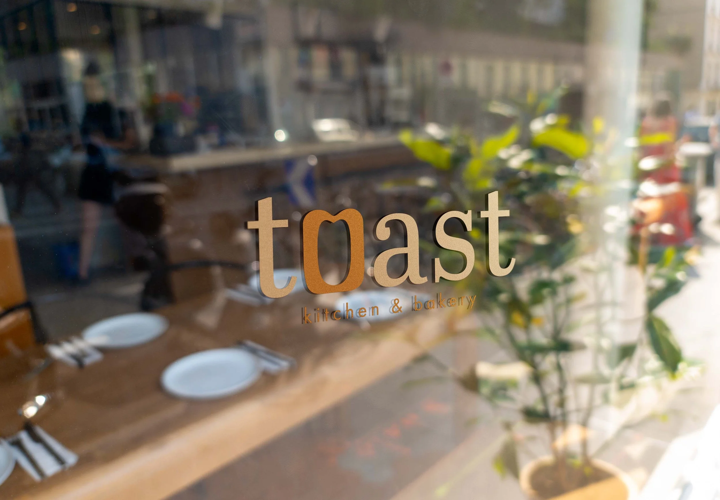
New Branding
Toast’s new branding utilizes warm brown tones, often found in toast, their namesake. Like their previous logo, this new logo takes advantage of the ‘O’ in its name to feature an icon that summarizes their brand.
The typography of the new logo appeals to a younger crowd who tends to refer simple, understated type as well as a more neutral color palette.
Logo Variations
Primary Logo
Secondary Logo
Submark

Logo Icon
Color Palette
#C49A6C
#B46A00

Typography
Abril Text Regular 60 pt
Futura PT Book 10 pt
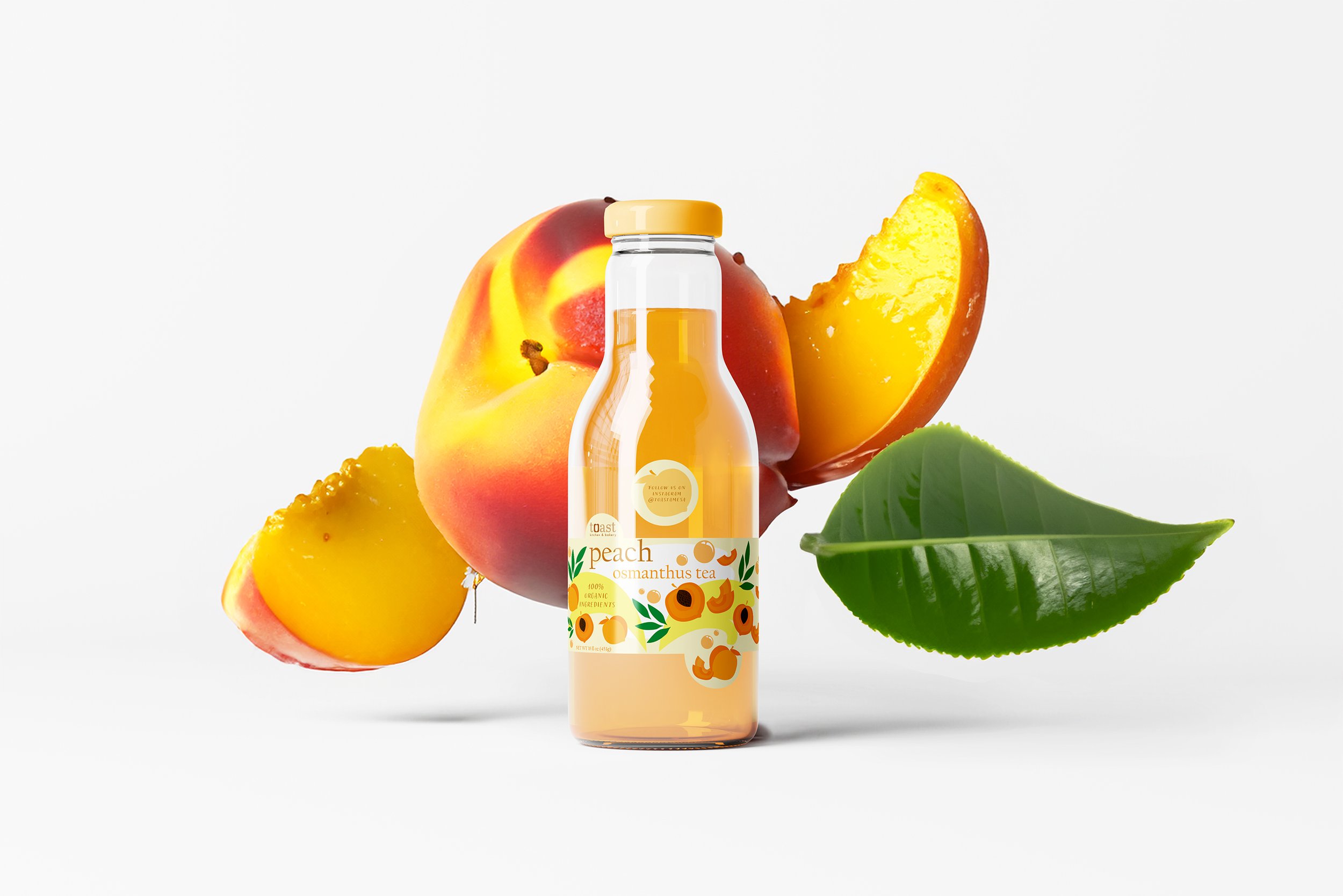
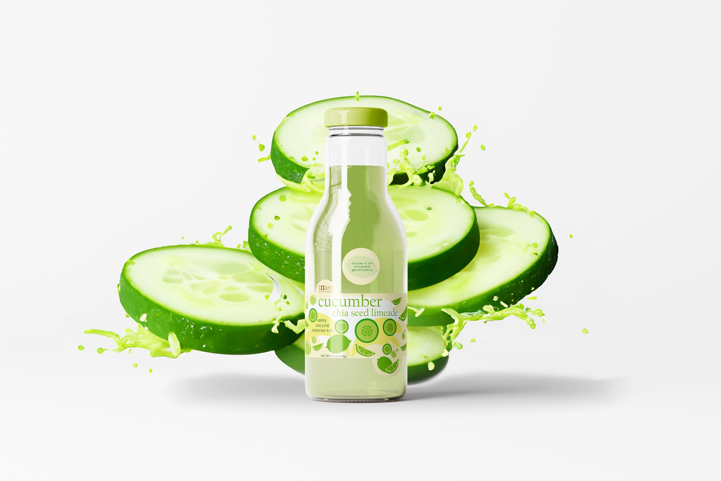
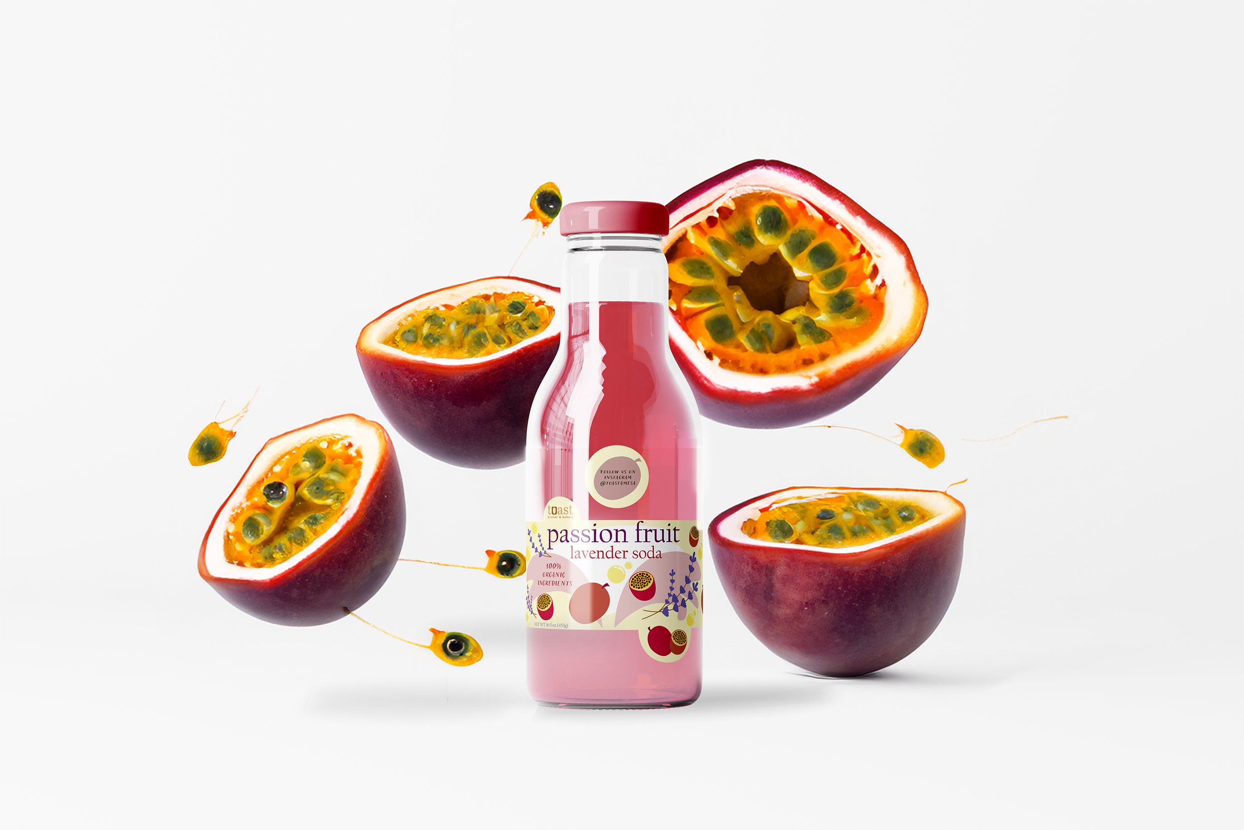
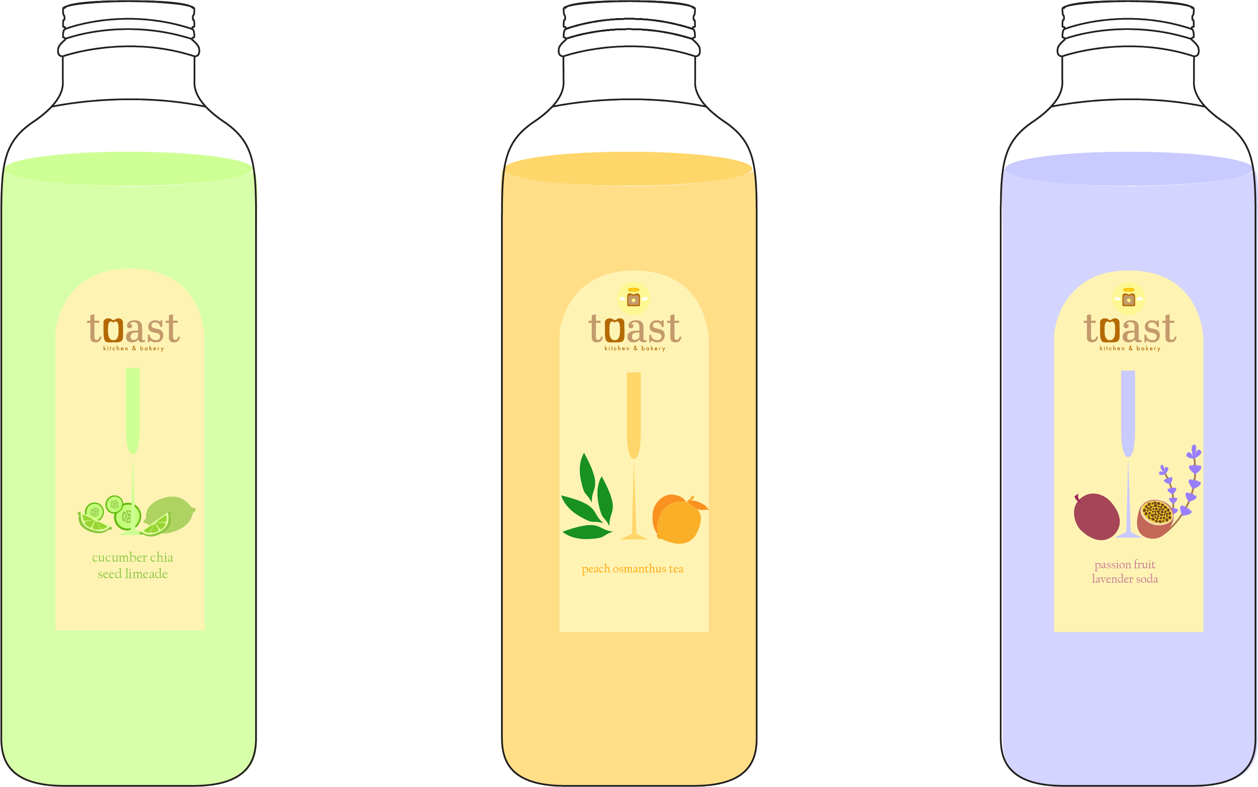
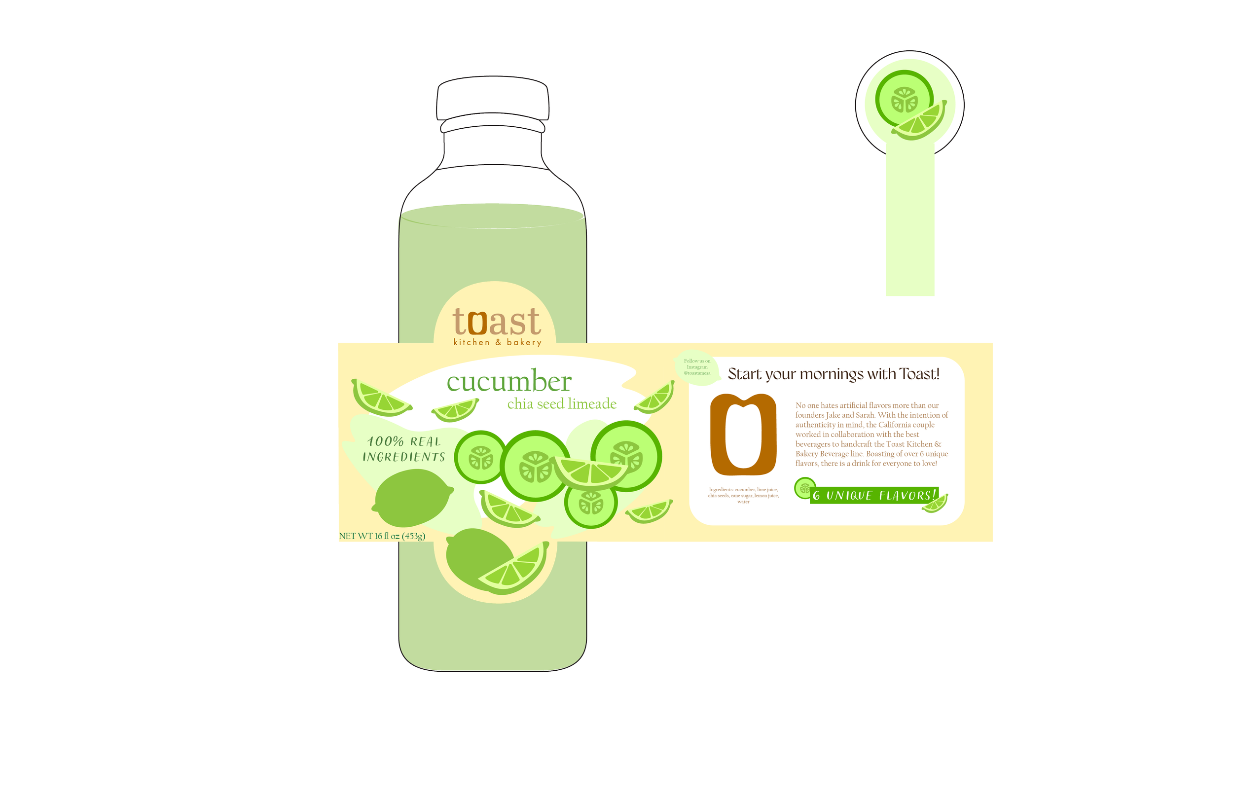
Packaging Design
While I could have chosen any of Toast Kitchen + Bakery’s menu items to create packaging for, I chose to highlight their made-in-house drinks. While they also serve cocktails during brunch, I was inspired most by the beverages they make that can be taken to-go. All of their drinks feature unique favor combinations and often have cultural influences.
While the new Toast logo features neutral brown tones, I opted for fun pastels corresponding with each drink flavor for this set of bottle designs. The color choices convey the refreshing, healthy, and energetic essence of the drinks while remaining cohesive and appealing.