The Jonsteen Co. Trees
Packaging and Branding Redesign
Creating an on theme packaging system for Jonsteen Trees and reworking existing branding.
*Not in affiliation with The Jonsteen Co. TreesTimeline: September 2023
Role: Graphic Designer
About Jonsteen Trees
The Jonsteen Company is a well established brand that sells trees and plants from seeds to saplings with the goal of pairing the right person to the right plant. Many of their germination kits are sold as novelty items in gift shops and boutiques and they focus on not only selling an item but an experience as well.
Objective
Create a 3 piece collection of trees with a united theme (i.e. Fruit Tree Collection, Tropical Trees, Holiday Trees)
Develop a design direction for the packaging system that can be expanded upon in the future
Refrain from using the existing company logo and develop something unique
Design Direction
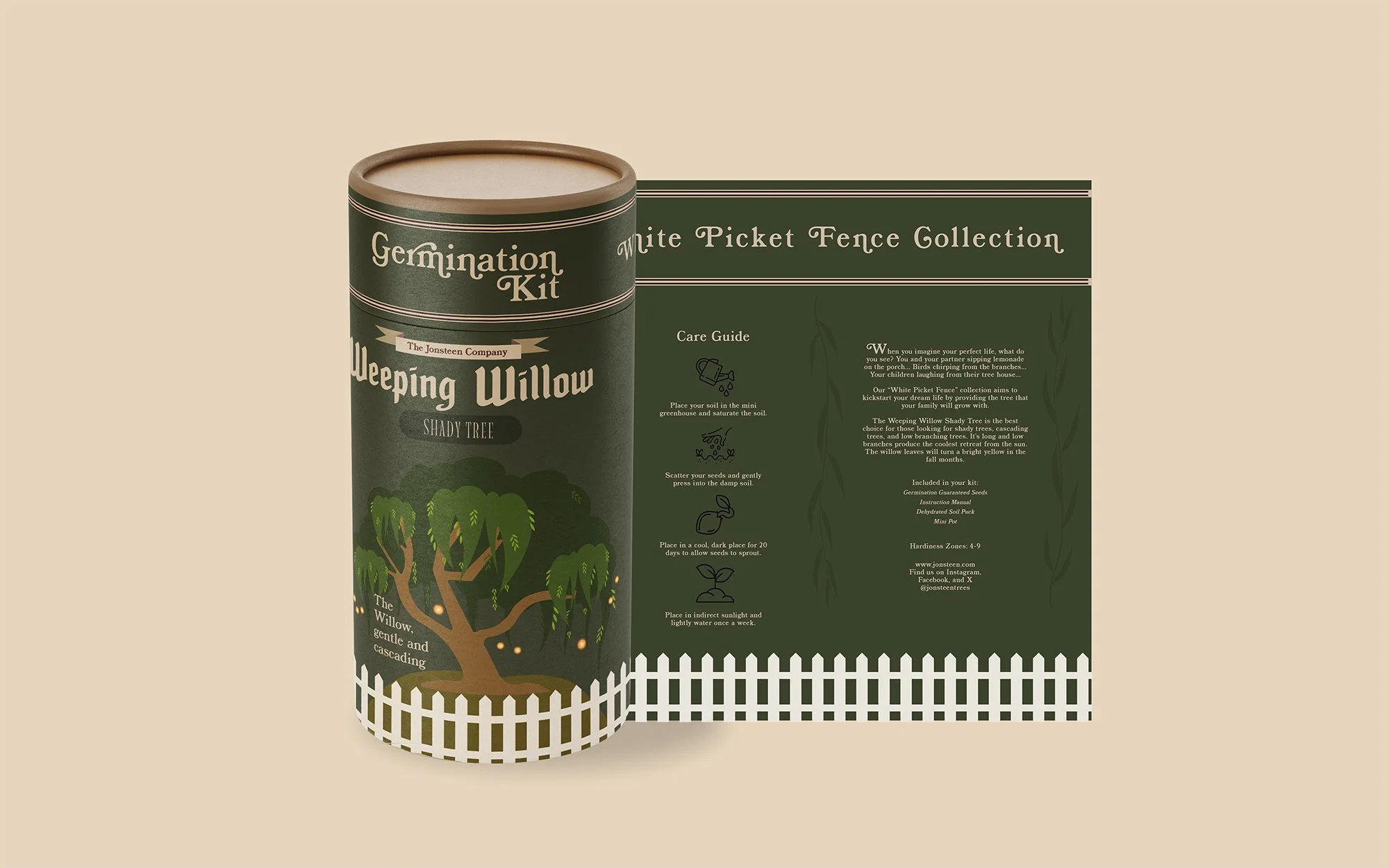
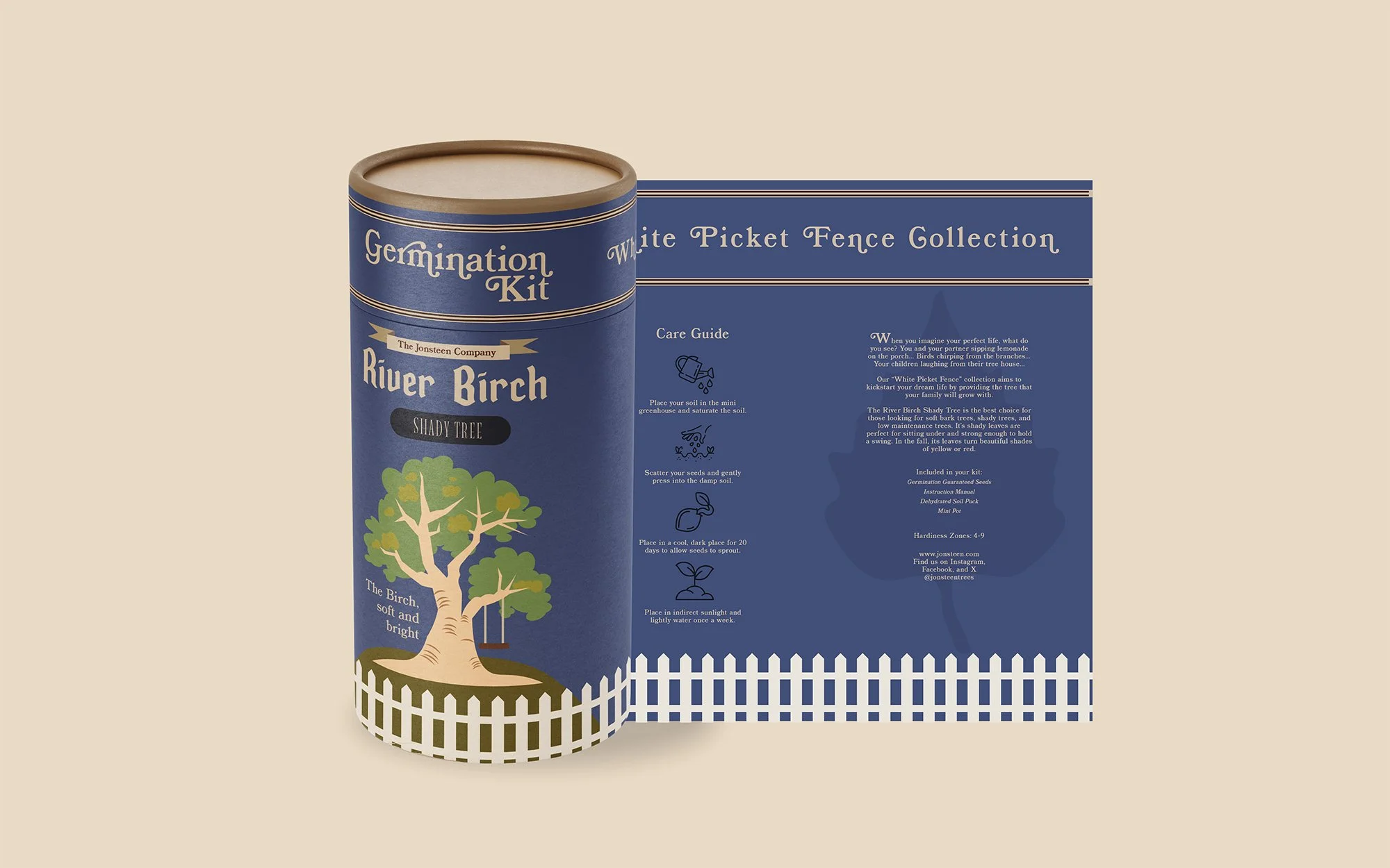
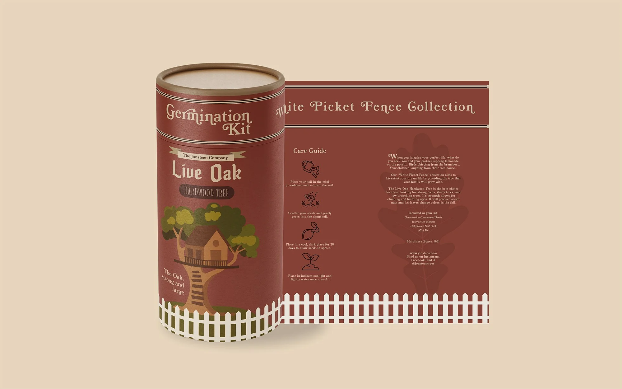
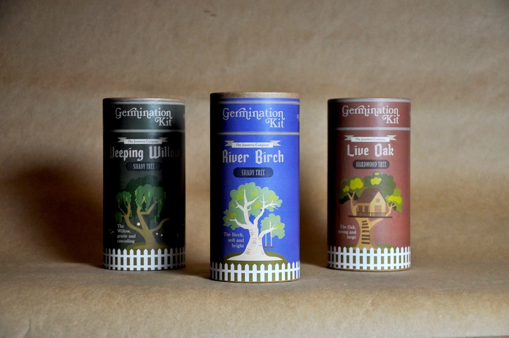
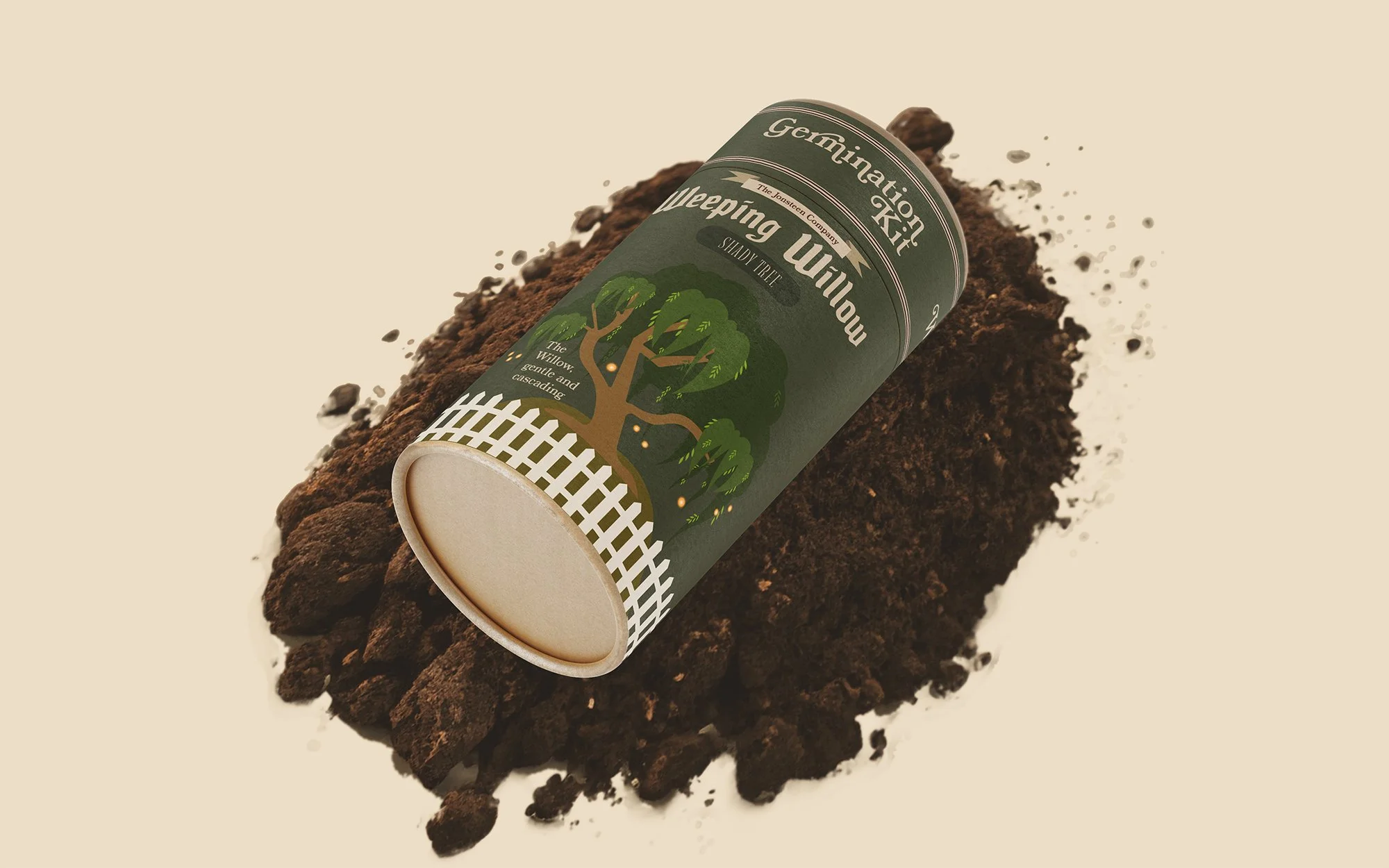
The theme that I decided for the 3 piece packaging system was “The White Picket Fence Collection”. The goal of the theme is to create a fantasy-like experience for consumers that makes them feel as though they are living out their ideal future in their perfect home, hence the “white picket fence”. The packaging has a warm, cozy, and fairy tale-esque aesthetic to divulge its audience in daydreams of their romantic future.
Theme
Color Scheme
The packaging uses muted greens, blues, purples, and reds as well as crude illustrations that are reminiscent of drawings from children’s picture books to further emphasize the feelings of nostalgia and longing.
The target audience for this collection is anyone with a home or who plans to one day own a home, and romanticizes their future. Because trees take so long to reach maturity, it makes sense to target young adults who do not yet have a home so that their tree has time to grow while they await their first house.
Target Audience
Mood Board
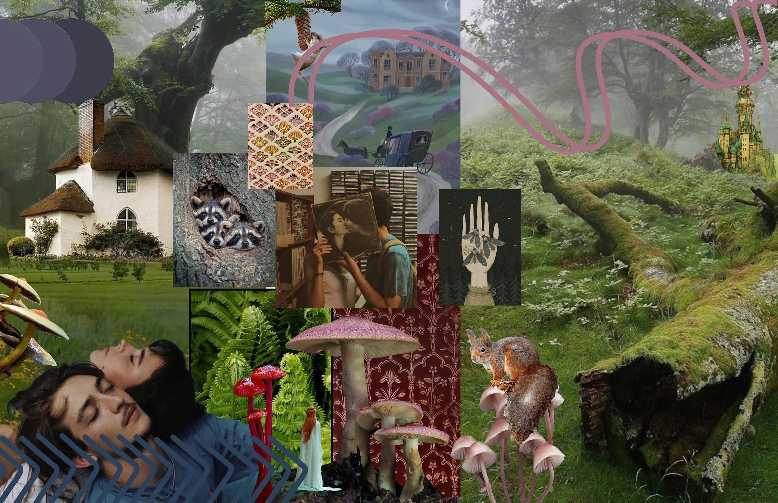
Ideation
The trees I chose to include as part of the White Picket Fence Collection were the Oak, Birch, and Willow. All three trees have a positive reputation for being family trees and beautiful additions to a front yard. Furthermore, all three trees have practical attributes that make them ideal for homes and families. To hep customers imagine how each tree will enrich their lives, my goal was to depict ways that the trees could be interacted with.
The Oak: Strong and branchy, the perfect climbing and tree-house host
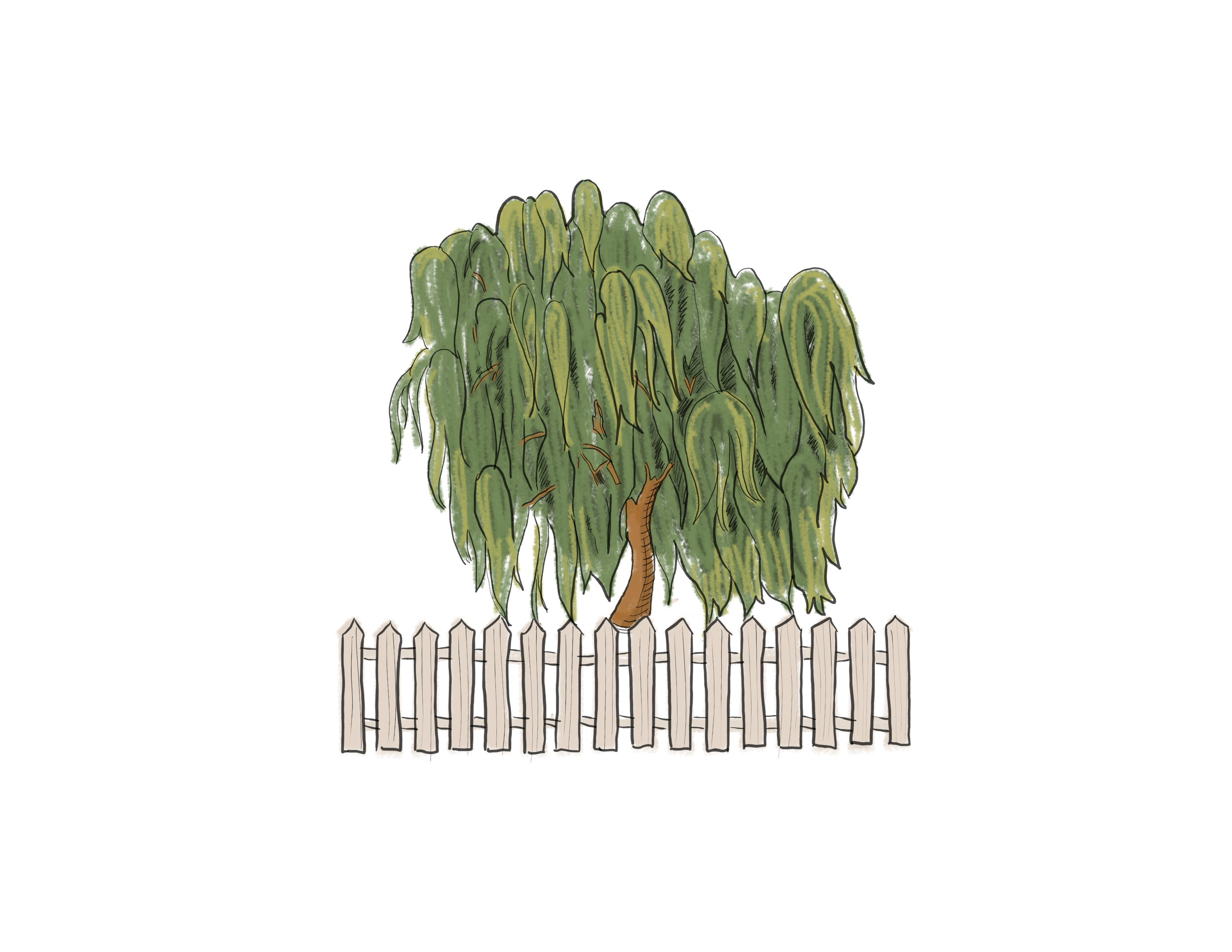
The Willow: Wide and shady, perfect for reading and picnics
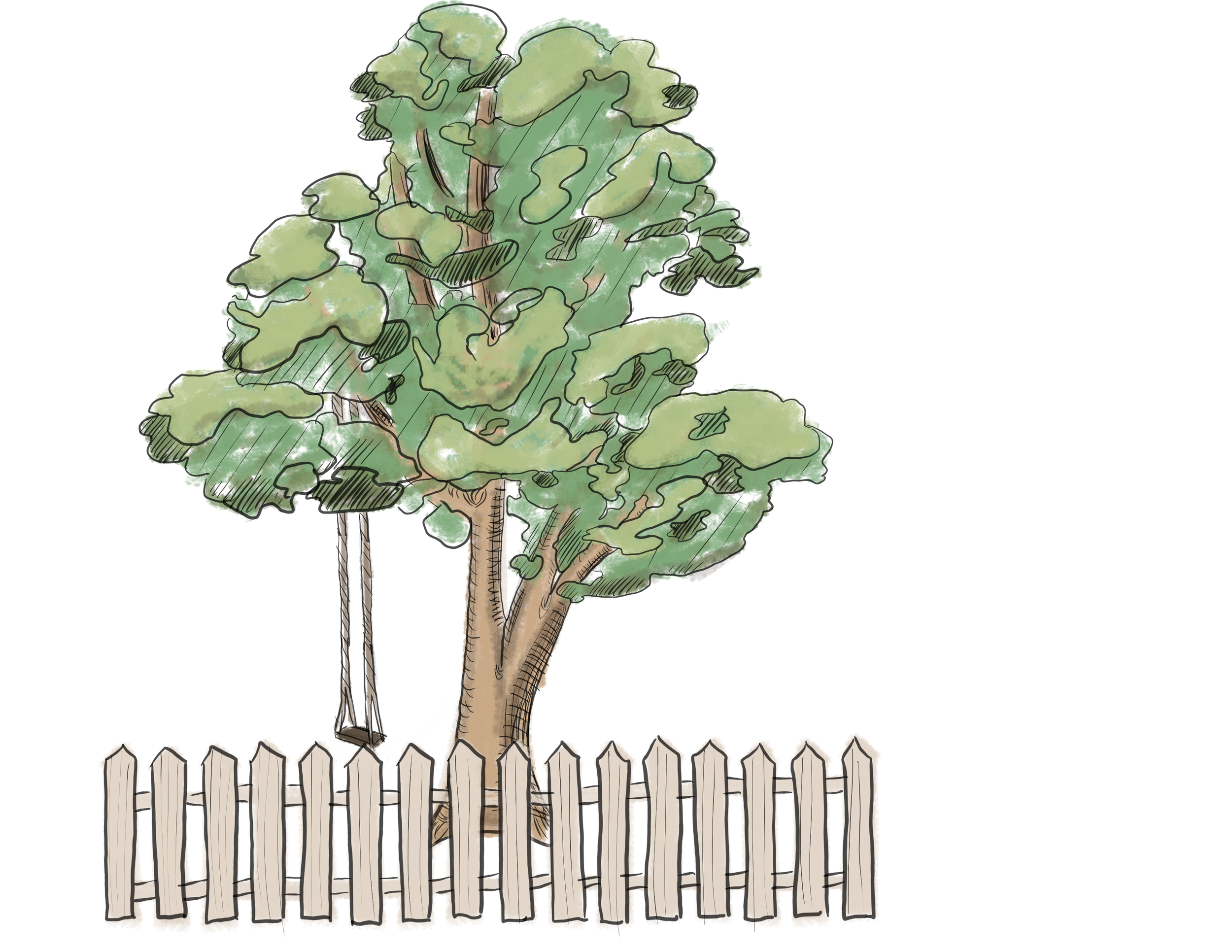
The Birch: Tall and sturdy, perfect for swings and ropes
Branding
The goal of the company title treatment was not to entirely replace the company’s existing logo but to instead create a title treatment that meshed with my theme. I used a neutral banner as the background to the company name “The Jonsteen Company” in alignment with the storybook-like aesthetic and to differentiate it from other elements on the label.

Company Title Treatment
Color Scheme
#71473D
#A86A5D
#646B52
#DED1C0
#6B789E
The color scheme for the 3 part system revolved around using muted, soft colors that corresponded with each tree and differentiated each package. The oak, known for being one of the strongest trees, is branded with a soft brick red color, as red is often seen as one of the most bold colors. The willow, known for its’ softness and light branches, is branded with a forest green, as seen in its’ leaves and because willows naturally are so wide and full of the color. The (river) birch, known for adorning riverbeds and ponds, is branded with blue, as is seen in the waters it surrounds.
The first and last shaded in the color palette are a warm brown and an off-white/beige, both of white are used on all 3 packages in the system. The act as the contrasting shaded needed in fine details and text but still conform to the color theme.
Typography


All of the fonts used in the packaging system collaborate to convey the storybook aesthetic I desired. Bookman, being the most legible in small size, acted as the type for the title treatments and body text. Fairy Tale, being the most stylized, eye-catching and true to the theme, was used for the tree names, which appeared largest on the packaging. And as a fun detail, Magnolia was used as an indicator of the category of tree, not extremely important information but a welcomed addition using a unique font.
Final Packaging