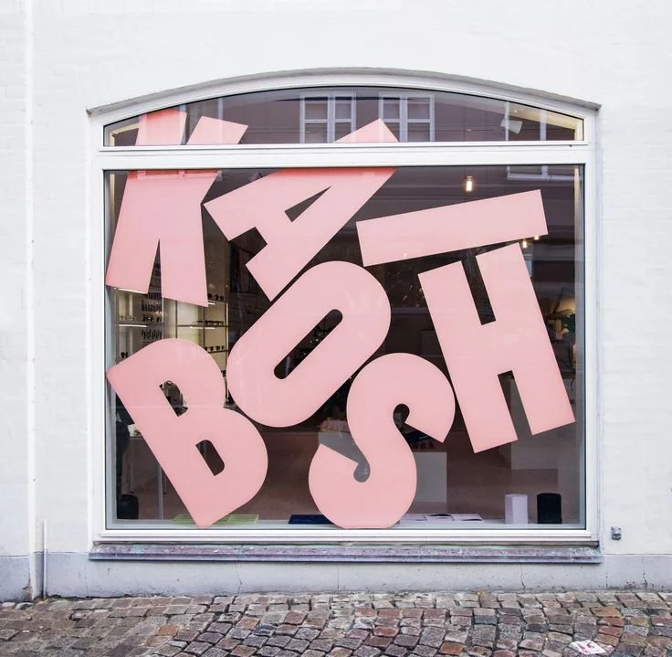
CSULB Design Building
Exterior Window Cling
A combination of imagery and graphics that pay homage to CSULB and its four Design programs.
Timeline: February 2024
Role: Environmental Designer, Graphic Designer
Challenge
As part of an initiative to highlight different departments around the CSULB campus, the senior class in the design program were tasked with creating a window cling for the entrance to the Design Building.
We were encouraged to showcase what the life of a design student may look like while being inclusive to the multiple programs within the department. Some of the parameters included the font that could be used, the color codes, text heights, the inclusion of a CSULB logo, and for the door panels to remain transparent.
Finding Inspiration
Like every project, the ideation process begins by examining how each element of design can contribute to the overall composition of our piece. Being that the task is a 2 dimensional window cling, form and texture were not factors. Our colors were also limited to select shades of gold, white, and black, therefore there was not much to explore here either. The project parameters did, however, allow us to experiment with graphic expression, imagery, typography, and space.
Imagery
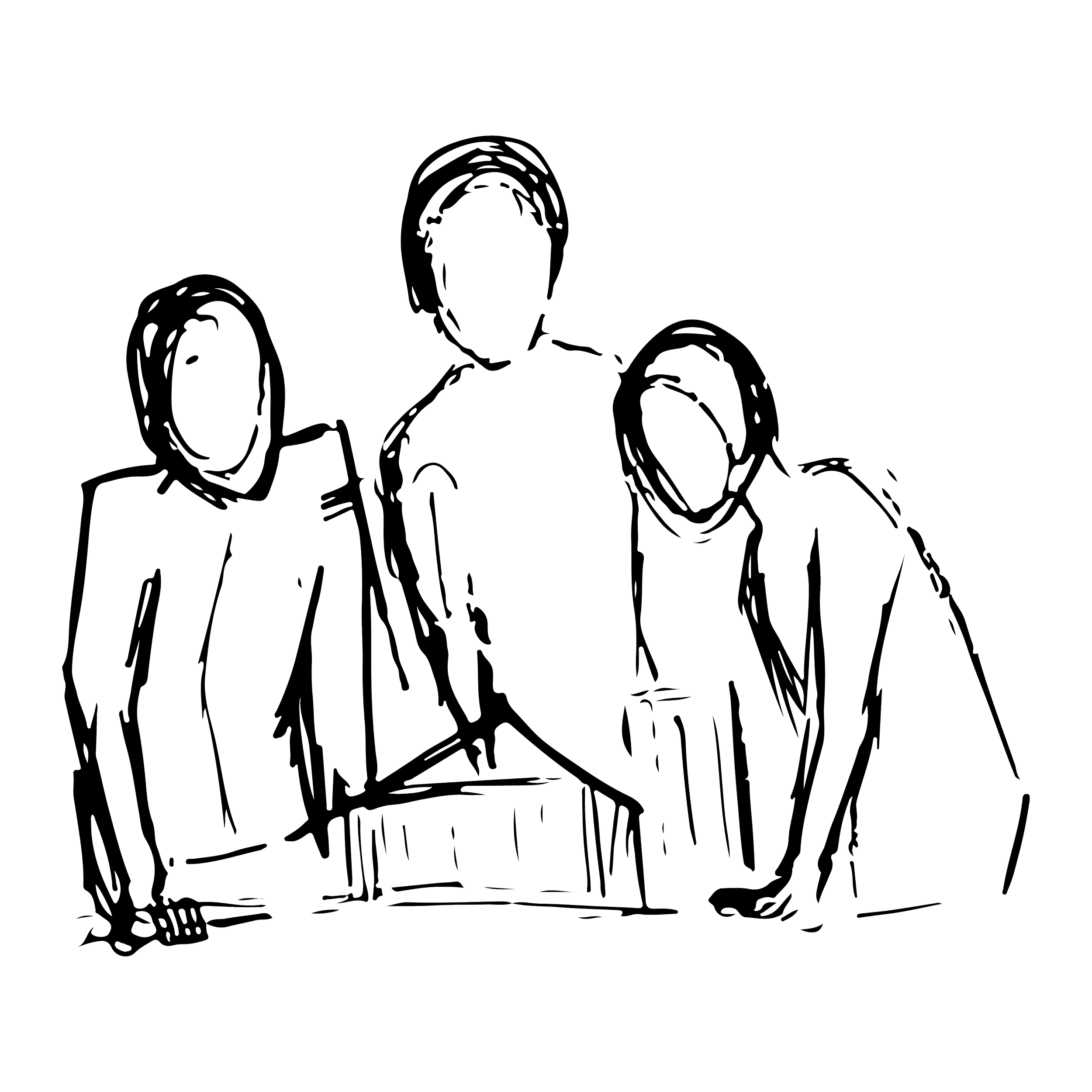
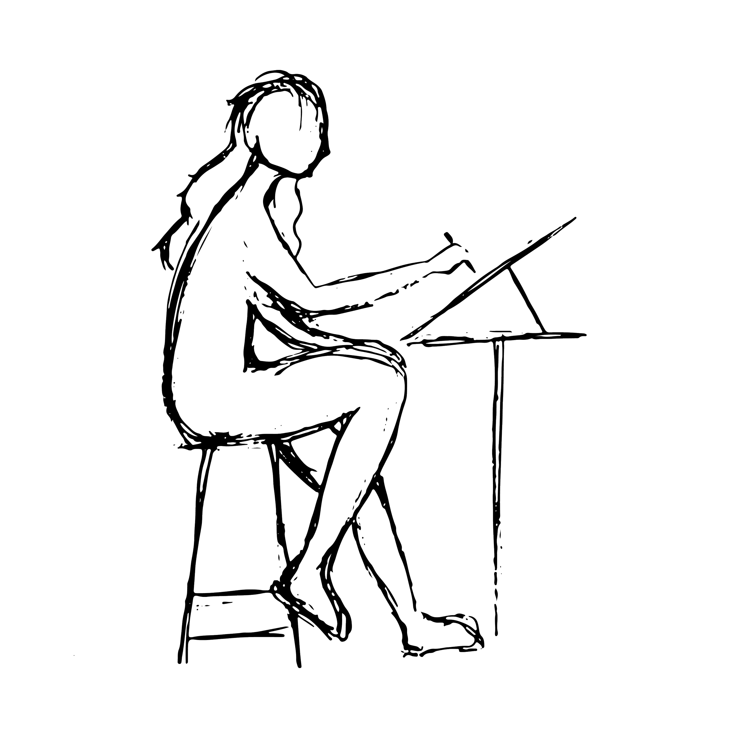
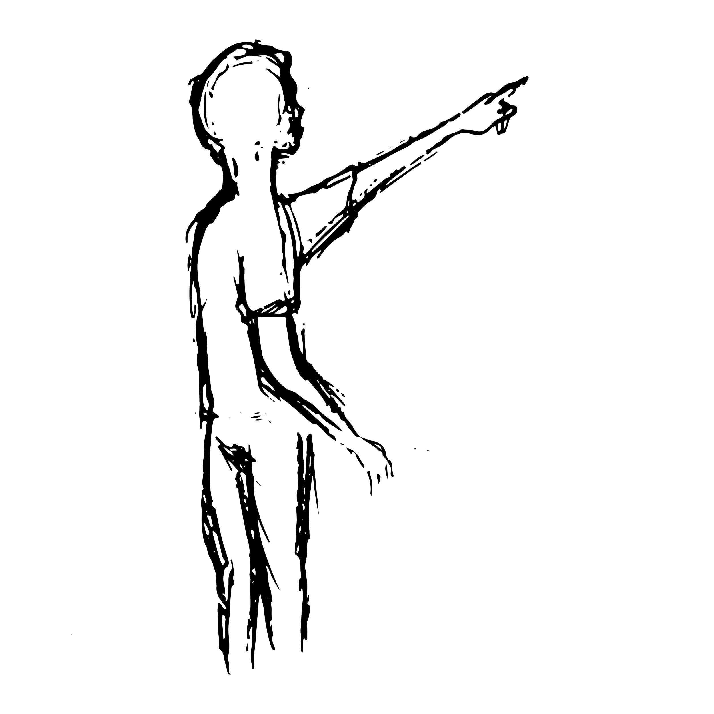
As designers, we often see the technicality in designs where others do not and can see the potential of a project even in unactualized sketches. Therefore, one of our initial inspirations were silhouettes of people using simple lines to indicate their shape and actions. This concept also would allow for us to illustrate some of the activities that designers may do within the building.

Inspiration Images
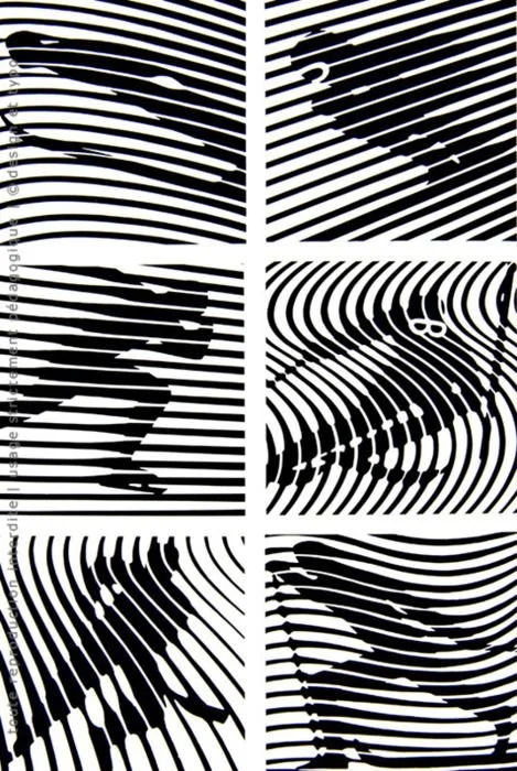
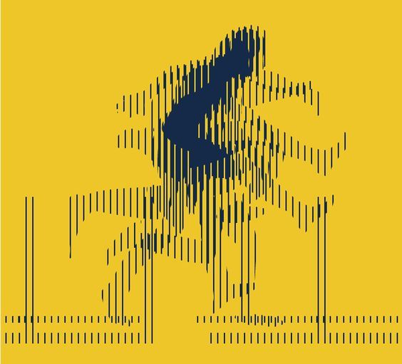
Graphic Expression
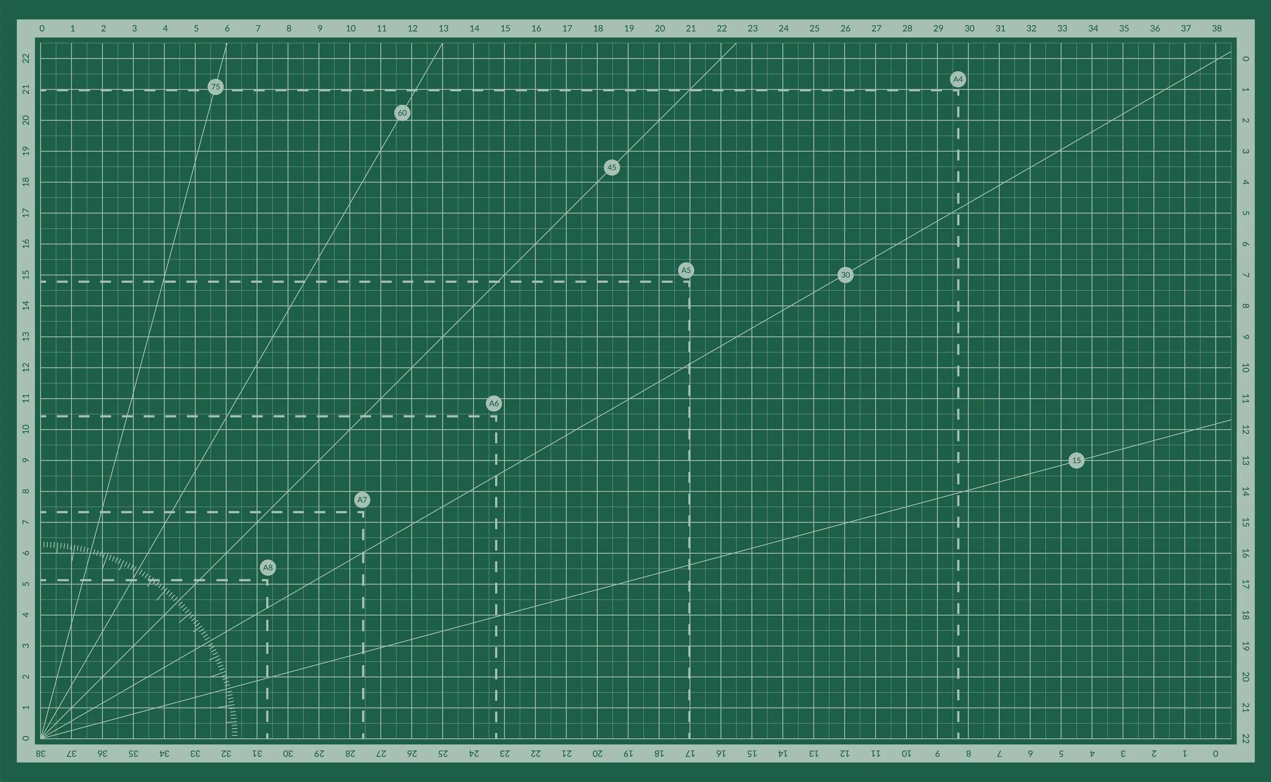
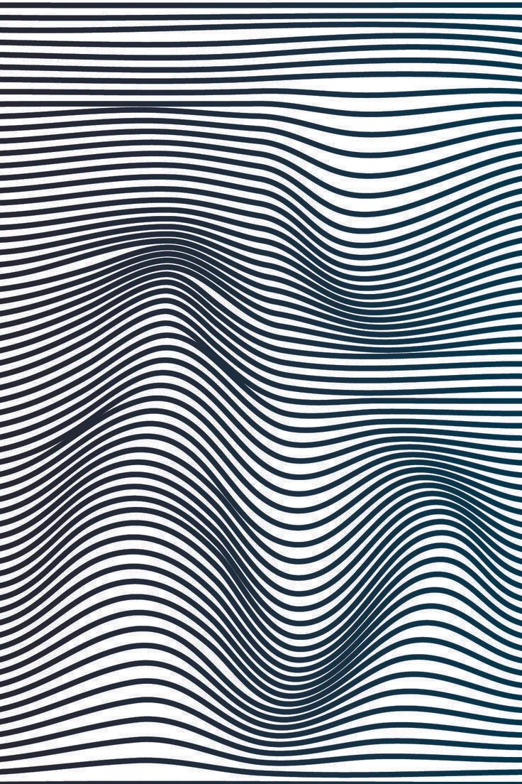
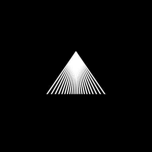
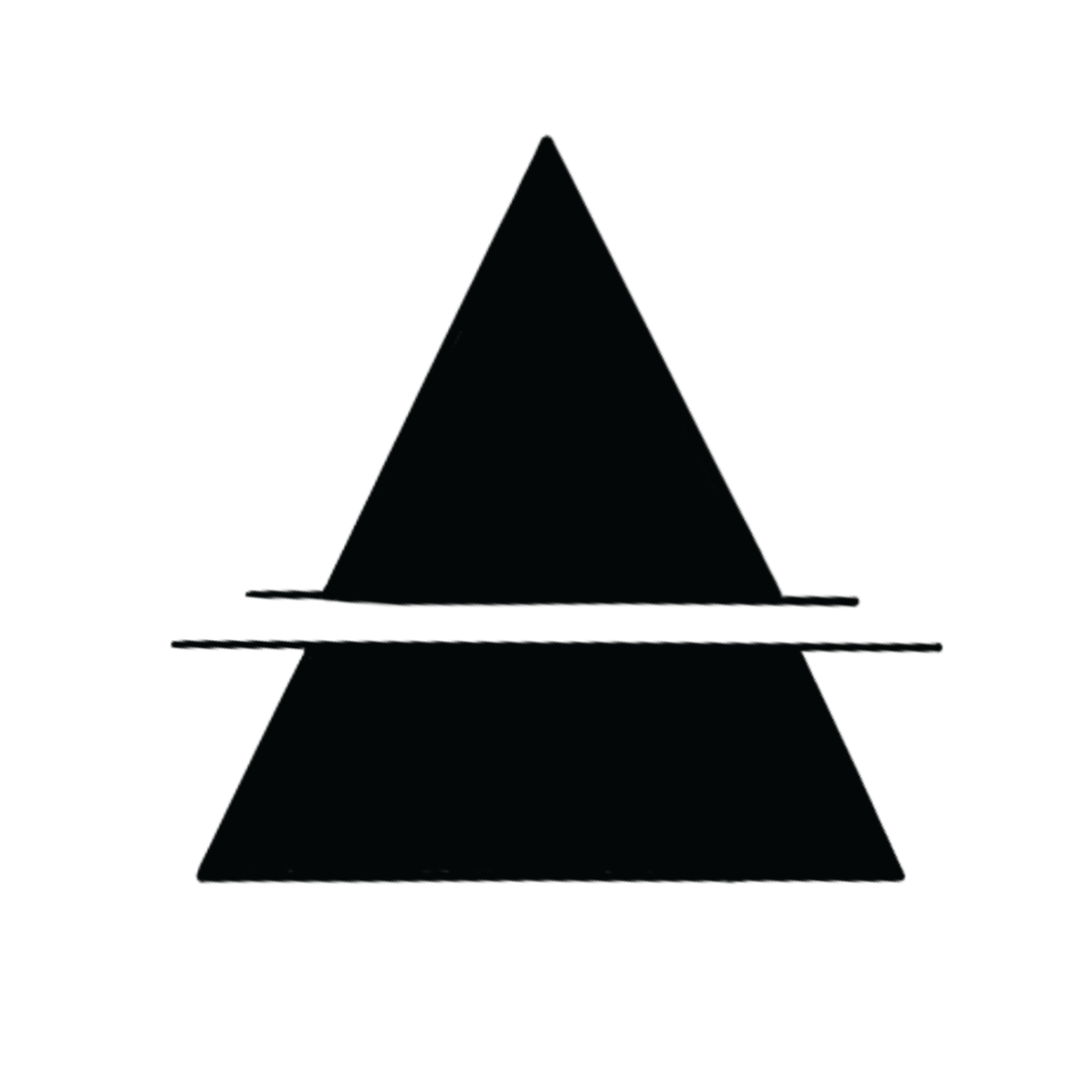
Although much of the design process now happens on the computer, as students, we like to remember where we started, and for many of us, that includes physical modeling. We were intrigued by the thought of utilizing a grid pattern like those on cutting mats or even in some computer software as a backdrop to the window cling. We also considered lines that weave and move to create density and reveal illustrations or text. Furthermore, the shape of a triangle was a particularly recurring shape in our brainstorm as it is a subtle nod to the iconic CSULB pyramid structure on campus.
Inspiration Images
Typography
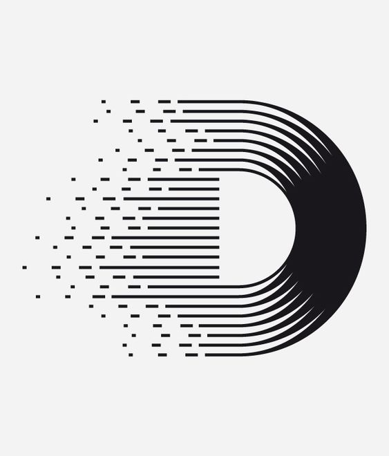
Although we were limited by font, we had creative freedom to apply different visual effects to the typography. We drew some inspiration from type that faded in, took up space in unusual ways, and text that seemed to appear through clever line work.
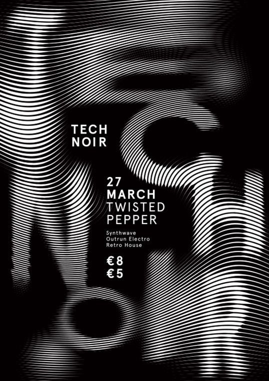
Inspiration Images
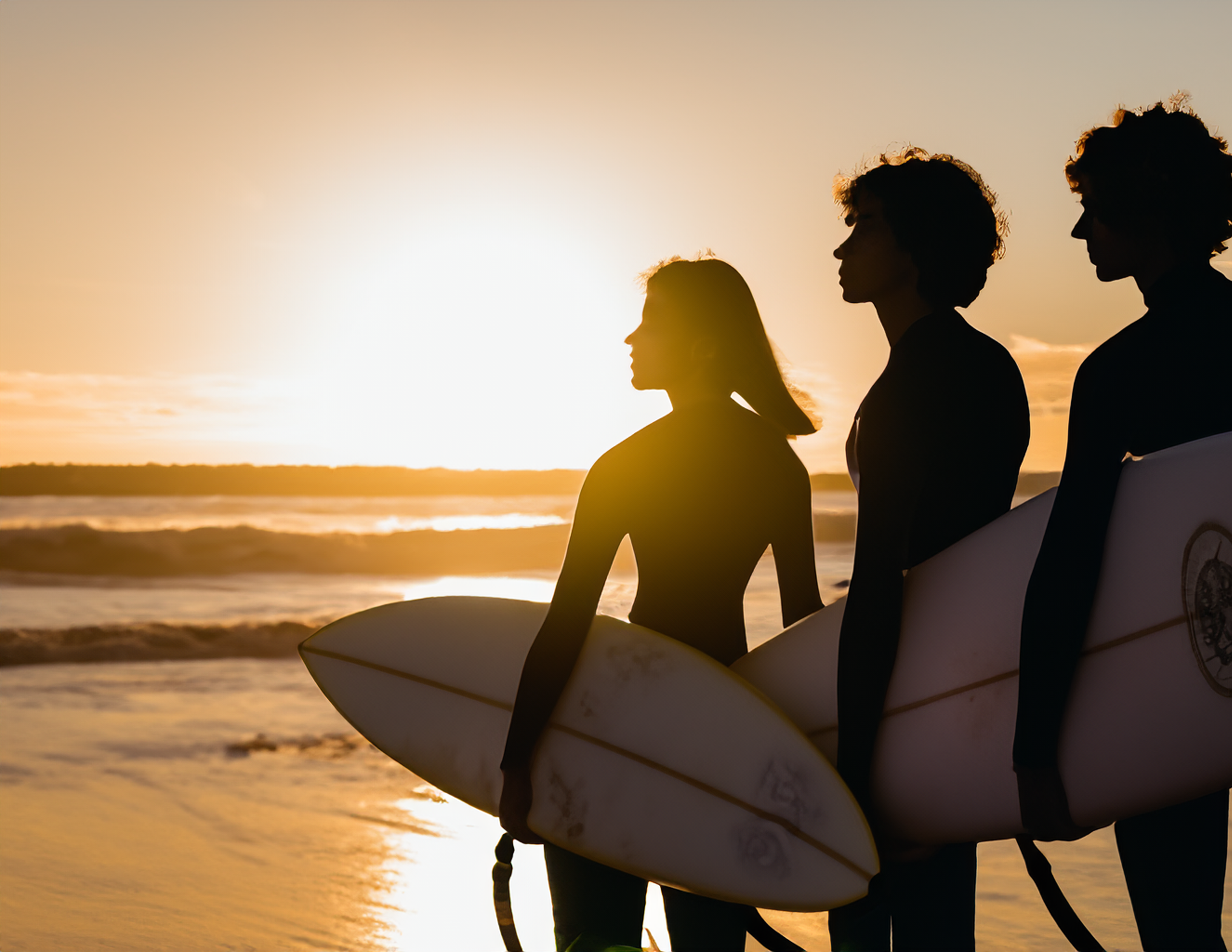
Utilizing AI
Throughout this process, we were also encouraged to experiment with new resources, namely AI, for inspiration and to help kick start ideas. This tool was particularly useful since we were told that using actual photographs of students or places may be tricky to get approval for, however, AI images needed no such sign offs.
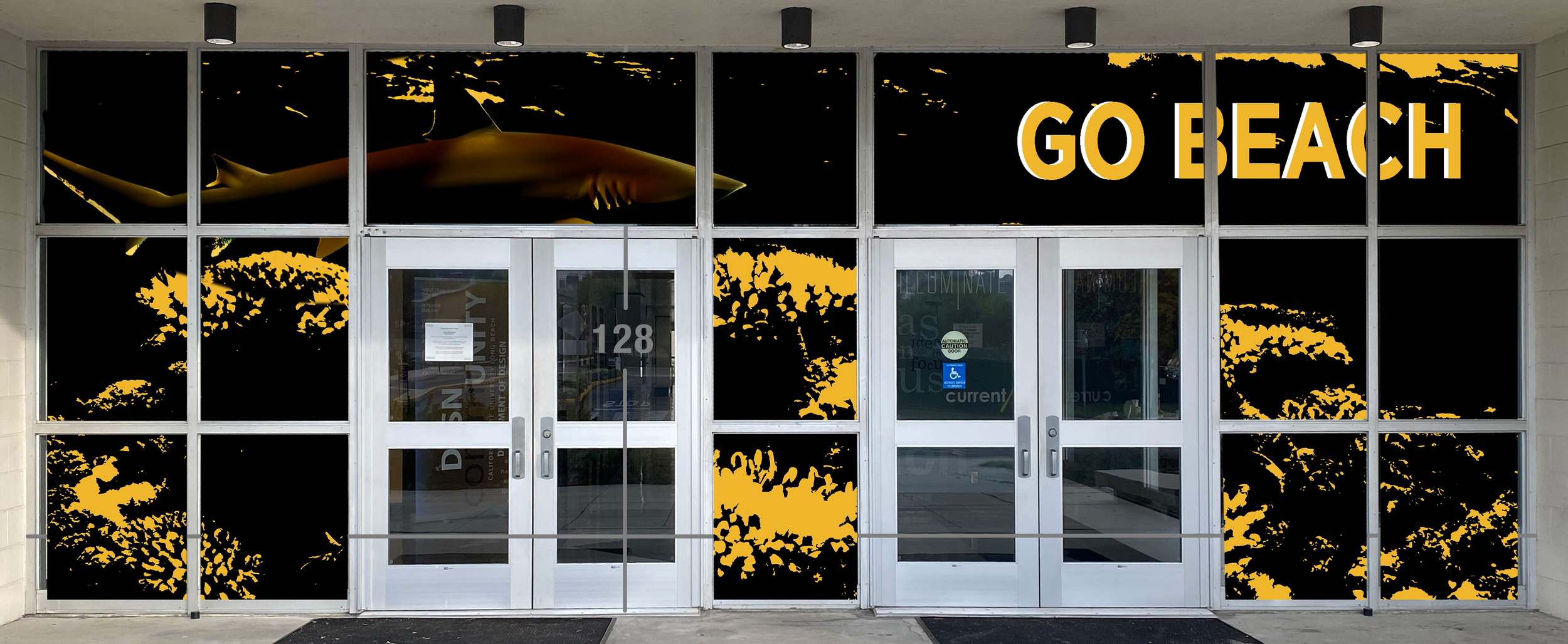
AI Imagery
We generated photos of surfers to highlight the laidback nature of the students being in a beach town.

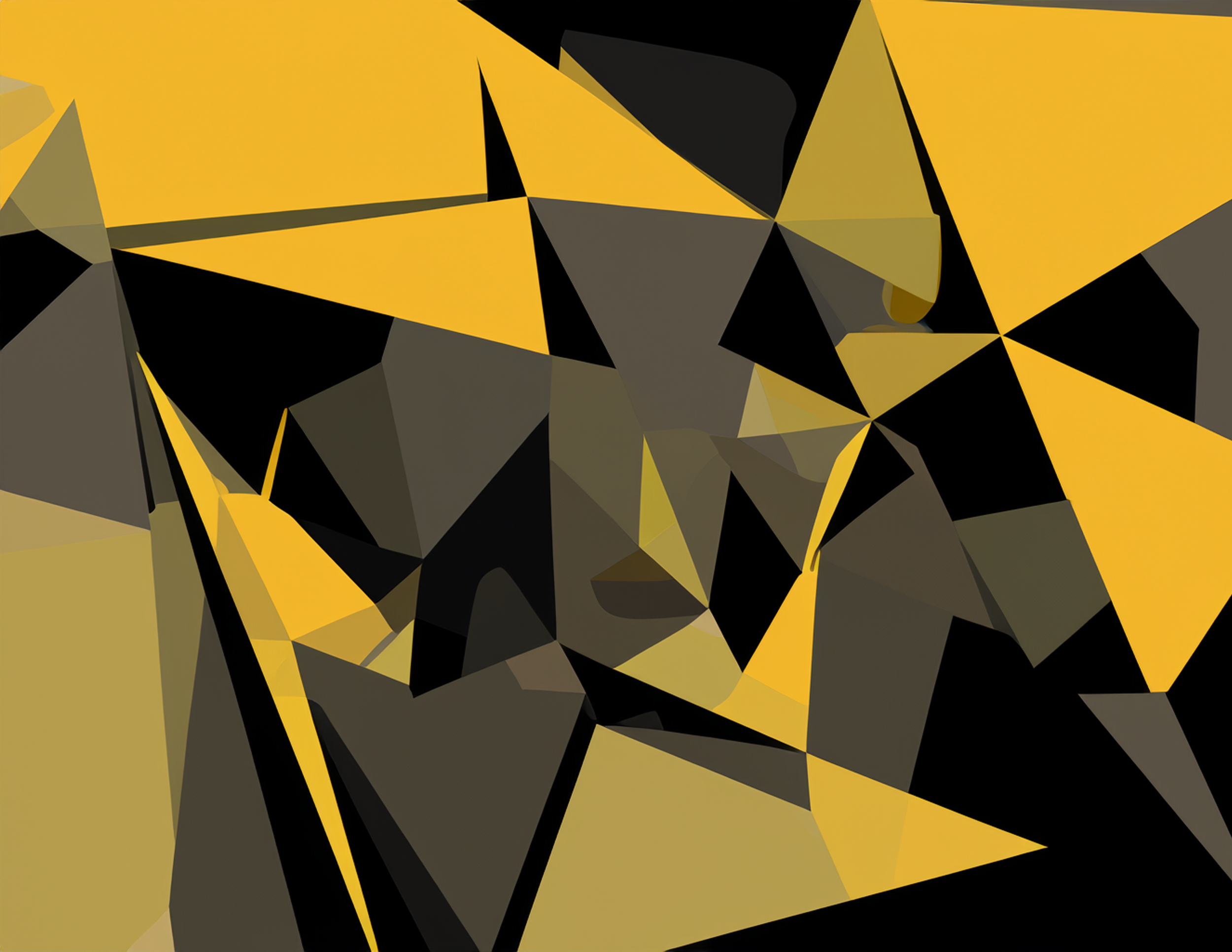
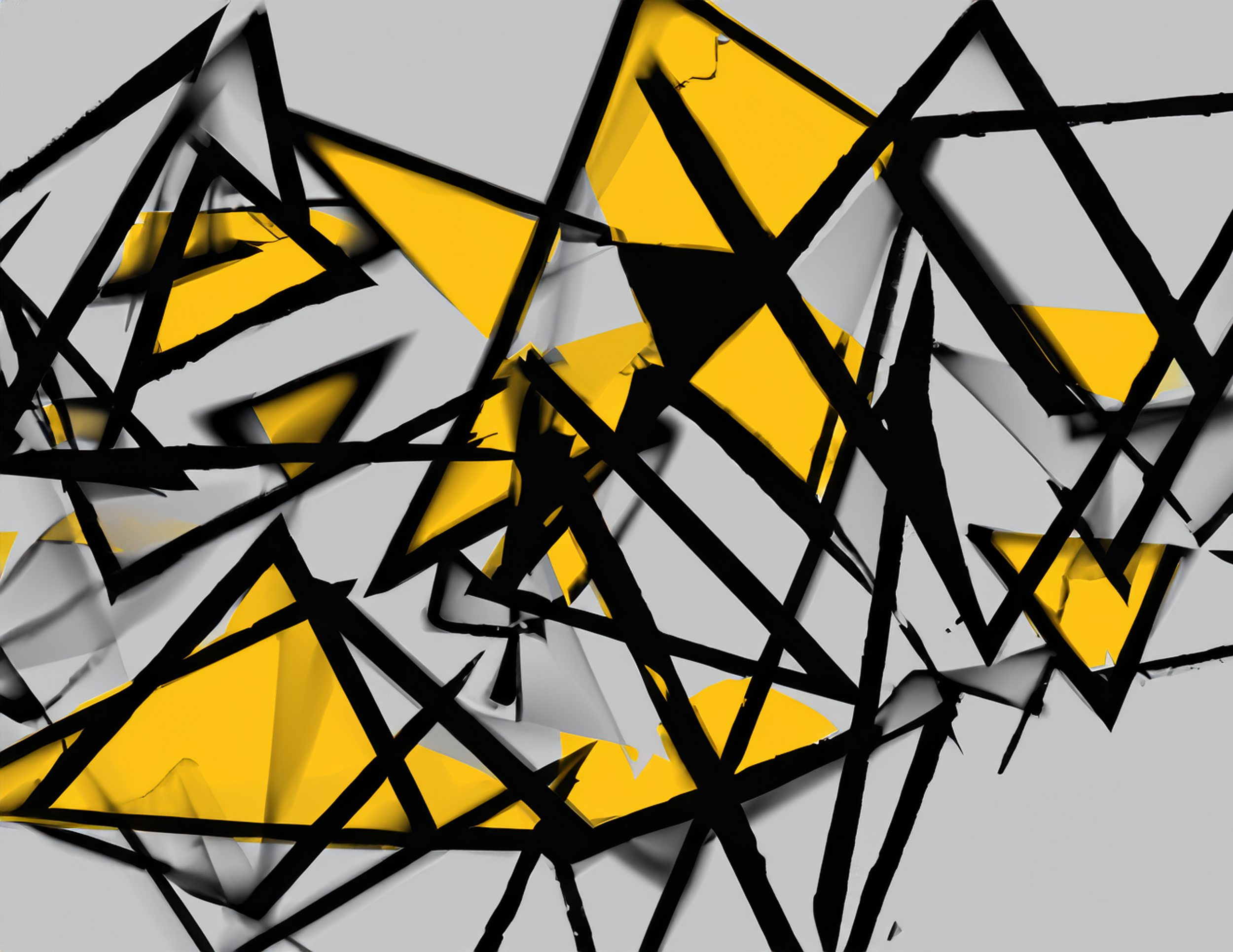
AI Graphic Expression
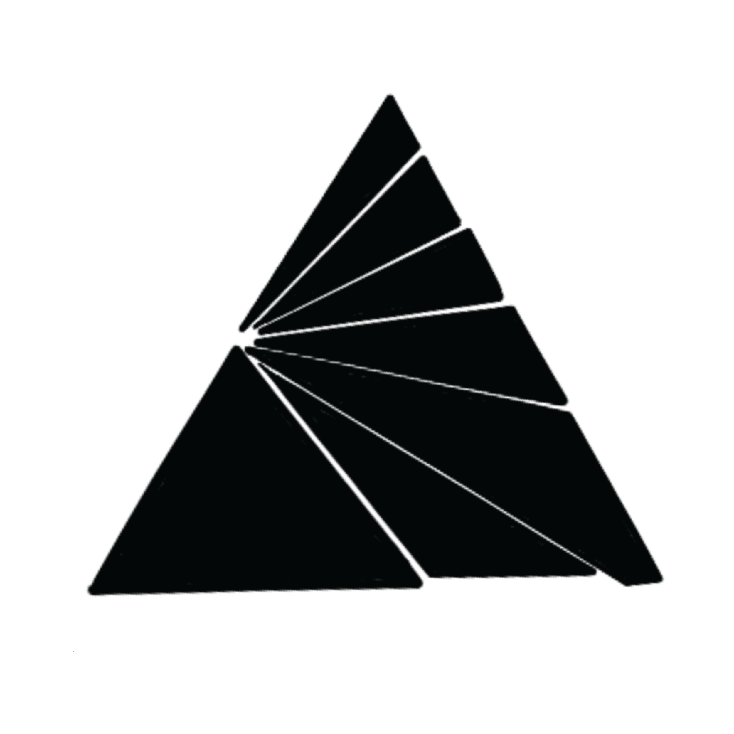
We gave Bard the instruction to produce triangular forms utilizing the colors black and gold (our university colors).
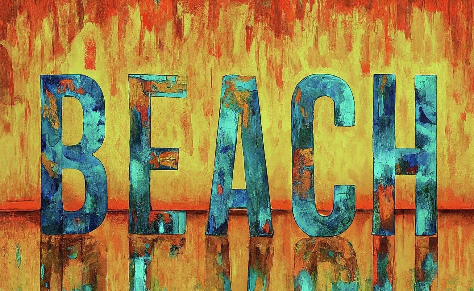
AI Typography
We gave Bard the challenge of incorporating color and the word “BEACH” which we at CSULB often use to refer to our school.
Conceptual Design
Themes
Students at work
Triangles (Pyramid structure)
Sharks (our mascot)
Gold, black, and white
Ocean/beach (Cal State Long Beach)
Phrases
“One Beach”
“We are Design”
“Go Beach”
“Beach”
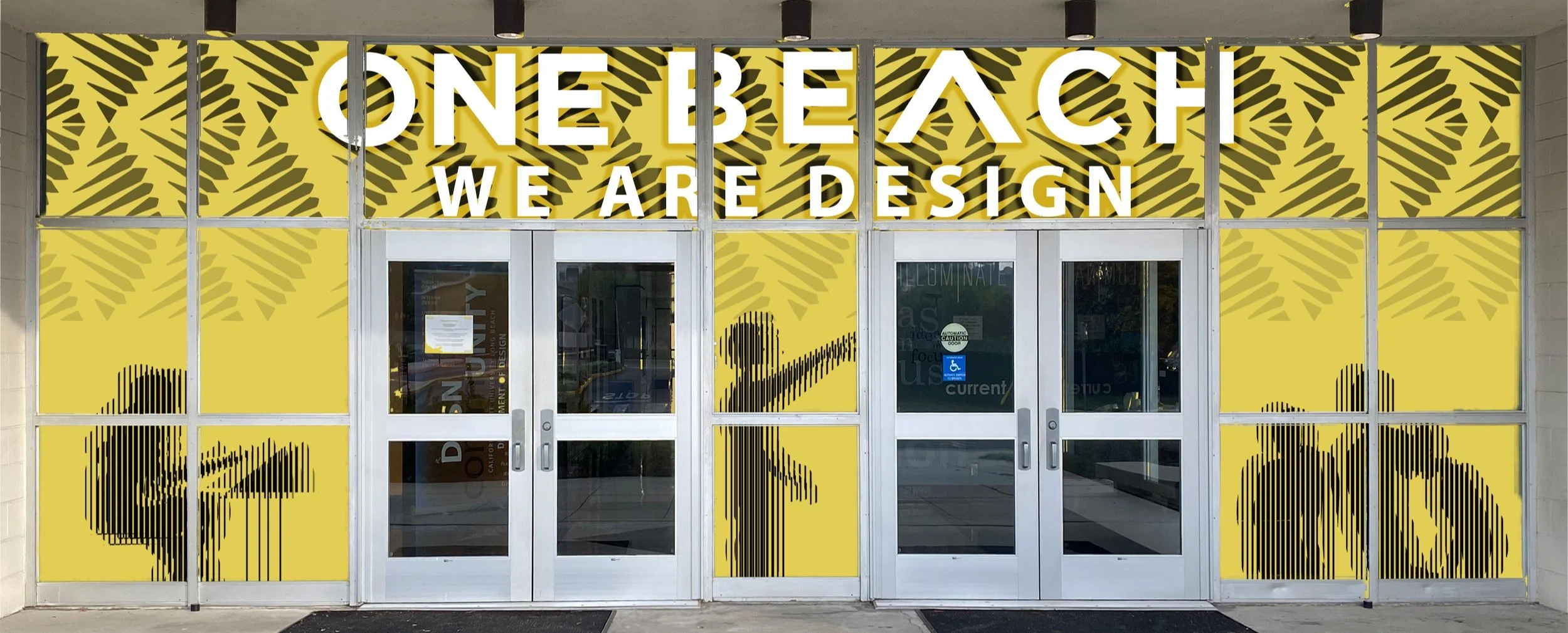
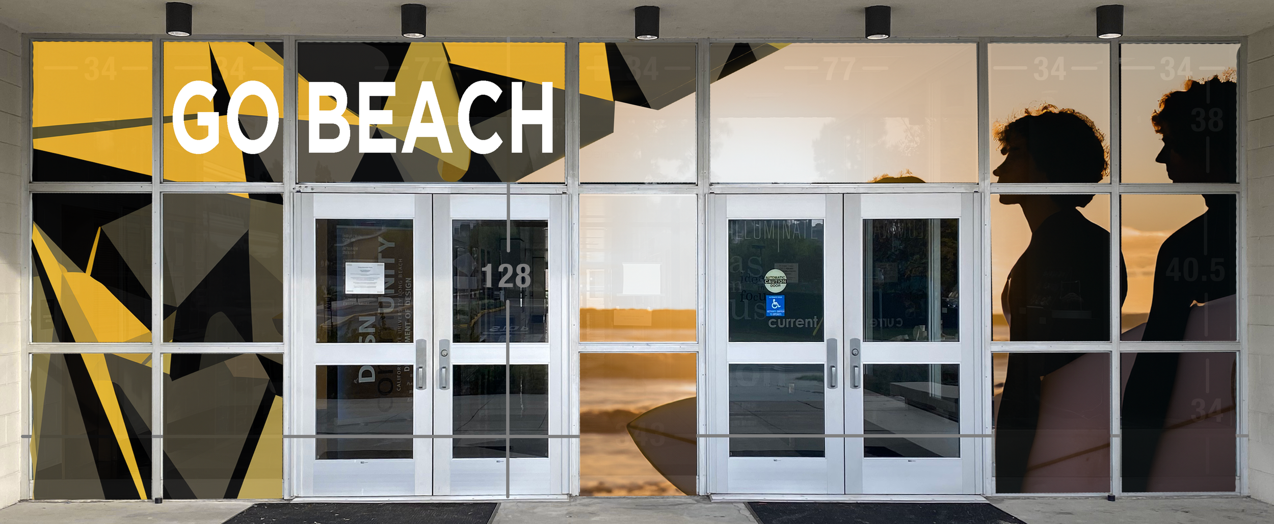
Ideation Sketches
Roughs: Narrowing on a Design Direction
Feedback from our mockup roughs
After a productive critic, we received some useful feedback from the client and made the following notes to change when approaching the final design.
Make the focus more on the student as opposed to utilizing generic university themes (beach, shark, etc)
Words shouldn’t perfectly fit between panels as it looks too blocky/forced
The shaky lifework silhouettes of design students may not read well at all times of day
“Design students at work” (top right) is a fun concept but as tech changes, “designers at work” may look different as well, so it may be best to stick to generic students not at work (think about how physical tools became obsolete with the rise of computers)
Final Design Proposals
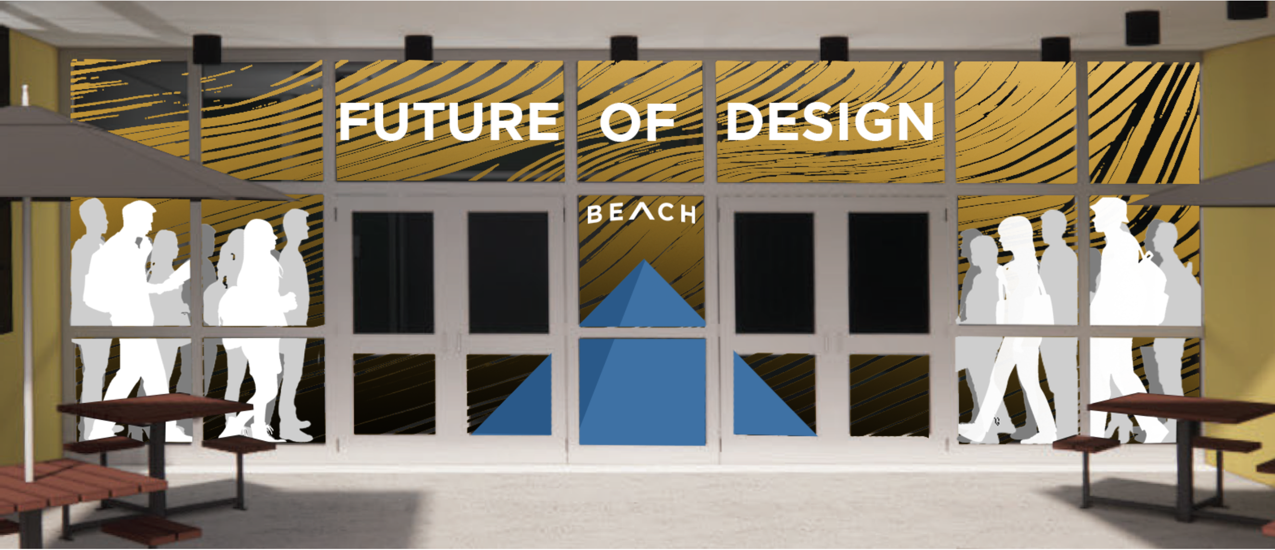
Concept A
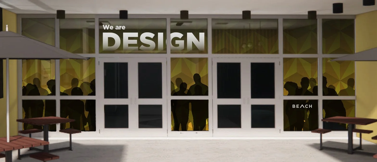
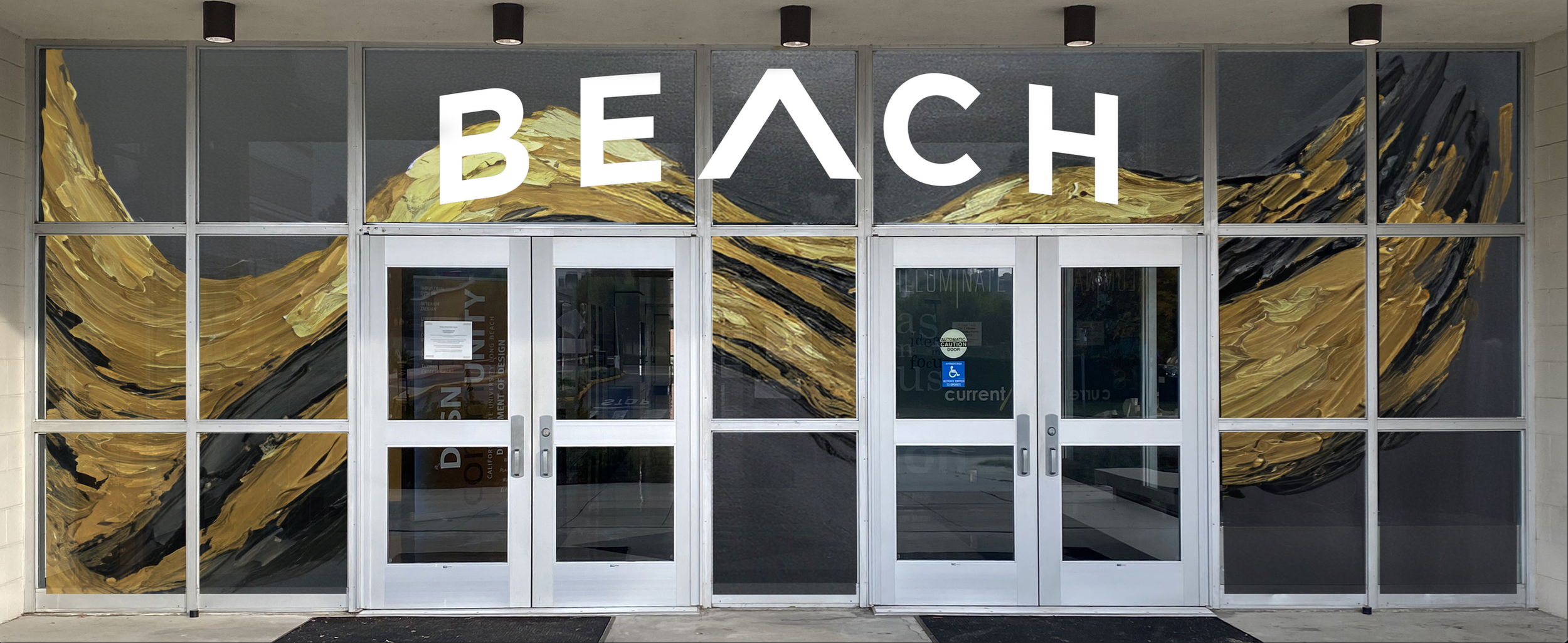
This design concept aims to give its audience a taste of what it looks like to be a student designer at CSULB. The window cling mirrors the creativity a designer puts into their own work as a student by reimagining letter forms in the text. The triangular shapes spanning the background act as a nod to the infamous pyramid structure on campus and students are shown flocking to the building . The cling also features the simple but clear message, “We are design” to portray our sense of unity across all disciplines of design.
Concept B
This design aligns with the campus goals and encourages visitors as well as potential students by grabbing the eye of anybody walking by through the use of graphic expression and typography. The design features a variety of different students walking towards the doors to signify that anyone is welcome within this building, as well as the whole school. We also included our pyramid in the center which helps direct the viewers eye to the typography above the doors.
Reflection
This project challenged me in unique ways that I haven’t faced in other projects. Namely, designing for a client on a project that was to be executed and not simply theoretical. In my experience, case studies and fictitious projects allow for a lot more creative freedom given the lack of parameters, budget, etc. Working with a client that has a certain vision in mind and creating work that blends well with their existing brand can be tricky and demands attention of their story and identity.