
Azure Resort and Spa
Wayfinding Design System
Creating a comprehensive wayfinding system suited for this tropical resort and spa.
Timeline: March 2024
Role: Environmental Designer, Graphic Designer
Challenge
Azure Resort and Spa is a new resort in need of a wayfinding system that properly expresses the resort’s coastal theme without using the obvious beach imagery.
The resort is in need of 6 different sign types throughout the site that allow wayfinding for both pedestrians and vehicles.
The logo is provided by the resort but the color choices, materials, and most specifications are not.
The Process
Ideation
Sketches
Concept creation
Proposals
Final Design
Ideation
Sketches
Coastal theme
Soft curves
Waves and layered elements

Sketches
Concepts: Narrowing on a Design Direction
Concept 1: Bright, coastal with the use of naturally occurring materials to emphasize the ocean theme.
Concept 2: Uses deep and rustic corten steel to portray the feeling of wise and sophisticated shores that are truly a get away from everyday life.

Concept 1
Sign types (left to right): Pedestrian Directional, Map Directory, Site Identification, Vehicular Directional, Building Identification, Monument
Materials: Stone (light grey) , Wood (brown), Paint (blue)
Dark grey indicates text placement

Concept 2
Sign types (left to right): Pedestrian Directional, Map Directory, Site Identification, Vehicular Directional, Building Identification, Monument
Materials: Corten Steel (brown), Paint (blue)
Grey indicates text placement
Proposals
Design Direction
The direction I chose was mostly based on Concept 2, utilizing corten steel for the majority of the wayfinding signs and natural stone as a compliment to the steel and to ground some of the more important signs.
In the first round, or the first attempt at a flushed out design, stone was only used in the site identification sign and monument sign, both of which are signs whose role is to mark the destination.
In my revisions, I expand the use of stone to all sign types, even if the stone simply acts as a base.

Round 1
Sign types, front and side views (left to right): Pedestrian Directional, Map Directory, Site Identification, Vehicular Directional, Building Identification, Monument
Materials: Corten Steel, Stone, Acrylic, Paint
Description:
This wayfinding system utilizes 2 main materials, stone and corten steel. The text on the signs are cut out and uses negative space. There is also a delicate wave design at the bottom of each sign. To give the signs more presence, the site identification sign and monument sign are mounted on large pieces of stone.
Feedback to consider for modification:
As a coastal resort, some sign edges could be softened to better illustrate the theme
Some signs could benefit from more dimension or variety.

Round 2
Sign types (left to right): Pedestrian Directional, Map Directory, Site Identification, Vehicular Directional, Building Identification, Monument
Materials: Corten Steel, Stone, Acrylic, Paint
Description:
This wayfinding system utilizes 2 main materials, stone and corten steel, with the addition of acrylic to improve the legibility and function of some of the sign types. The text on the signs are cut out and uses negative space. There is also a delicate wave design at the bottom of each sign. To give the signs more presence, the site identification sign and monument sign are mounted on large pieces of stone. All other sign types are mounted on a slab stone base to give it height and variety.
Feedback to consider for modification:
Cut outs work better when they are purely decorative as the time of day and lighting will drastically affect the readability of cut outs
Sourcing and pricing for large pieces of whole stone is impractical so consider using smaller pieces or another material.
Final Signage Package
Materiality

Stone (Stacked)
The inspiration for this material lies in the bright and calming stone that makes up so many coastal cliffs. The color and texture of the stones tie into the local scenery and emphasize the resort’s seaside theme.


Inspiration Images
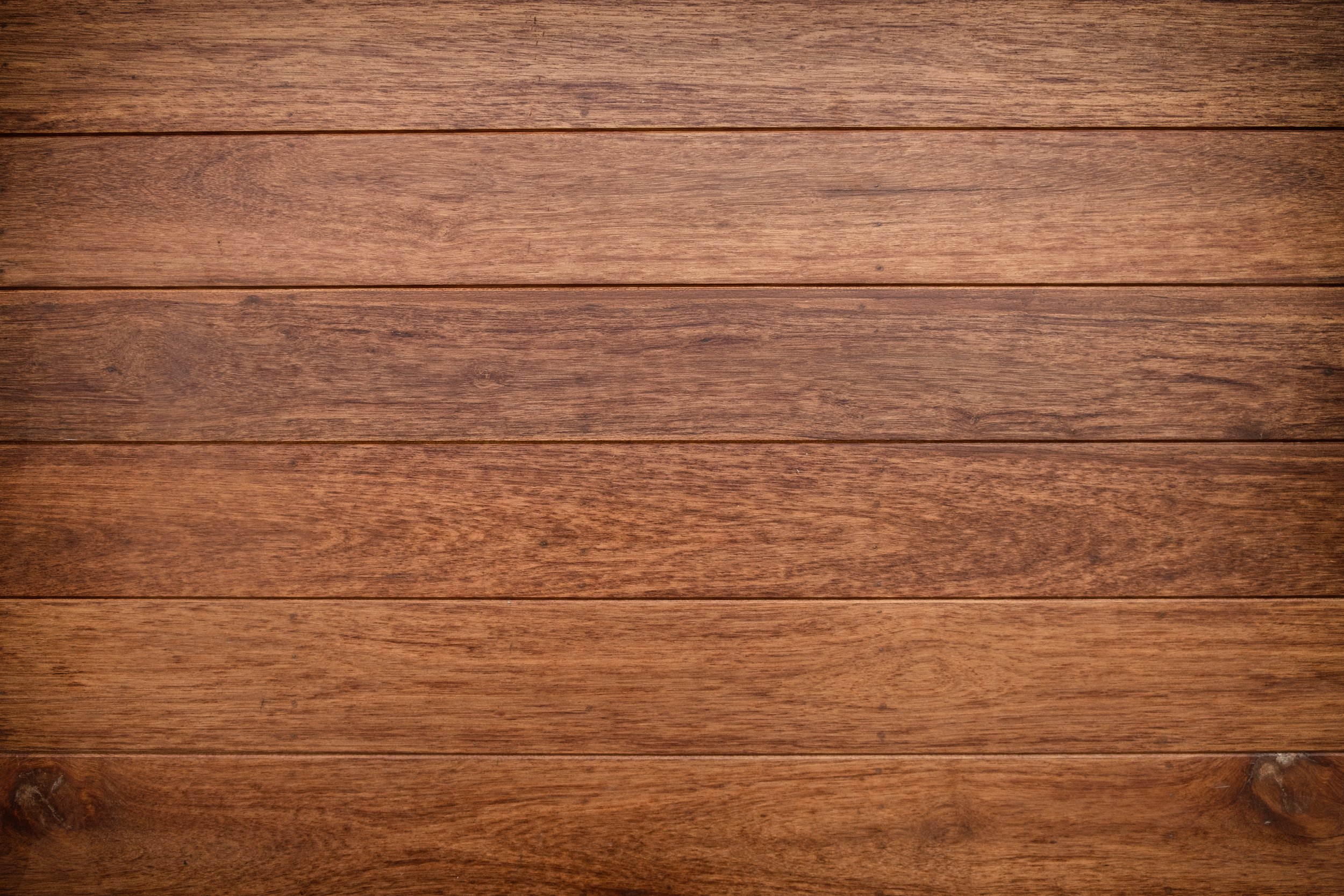
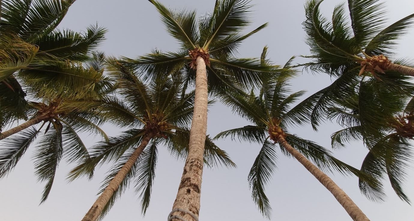
Walnut Wood
The inspiration for this material comes from natural wood that often compliments sandy beaches. All kinds of wood can be spotted on coasts from palm trees, to driftwood, to creaking staircases. The choice of deep walnut is meant to add contrast to the signs and offer an organic element.


Inspiration Images

Corten Steel
The inspiration for this material is drawn from the salty, damp air and water that erodes even the strongest of ships and structures. The resort acts as a get away from daily life for guests and corten steel is meant to stimulate the imagination and induce images of a remote island get away far from home.


Inspiration Images
Typography


Wayfinding and Environmental Graphics
Pedestrian Directional Sign
Below is the final design concept for the pedestrian directional sign. As a last minute change, I incorporated the use of walnut wood for the majority of the body. The purpose of this change was to help differentiate the sign types, add variety, and make it more approachable. The sign uses raised and painted text but a cut out wave design at the bottom. It also uses softened edges where possible to contribute to the calm and soft beach atmosphere of the resort. Finally, addressing some of the feedback I was given, I changed the solid stone base to stack stones as it is more cost effective and easier to source.

Pedestrian Directional Sign Final

Pedestrian Directional Sign Mockup in Environment
Map Directory Sign
Below is the final design concept for the map directory sign. This design did not undergo too much change throughout the design process. It consists of a directory that is read by standing over it, much like reading a book, and encourages people to approach it. Addressing the feedback I was given, the base is now made up of stacked stones rather than a large slab and the logo and text are both aligned left instead of right as it is a more intuitive format more English readers. Furthermore, rather than using cut outs for the logo, it uses raised letters since negative space, cut outs may be difficult to read in low lighting.

Map Directory Sign Final

Map Directory Sign Mockup in Environment
Site Identification Sign
Below is the final design concept for the site identification sign. In the final design iteration, I included a wood base for the stone sign to sit on. This inclusion creates consistency since wood was incorporated into other sign designs within the system as well. Furthermore, one of the specifications I was given was to place text at least 30” above the ground. In order to achieve this, the text needed to be placed higher on the sign, resulting in text that was not centered vertically (see Site Identification Sign Developments Side-by-Side below for versions A and B). To remedy this, the wooden base adds elevation to the sign and allows the text to be correctly centered on both the corten steel plate and the stone body.

Site Identification Sign Final

Site Identification Sign Mockup in Environment
Vehicular Directional Sign
Below is the final design concept for the vehicular directional sign. Like the pedestrian directional sign, I changed the material of the body from corten steel to wood. This gives the sign warmth and approachability as well as variety. And like all of the stone in the final iteration, the large slab was replaced with stacked stones to make sourcing and pricing more amenable.
Notice, the signs are grouped by function and signs with similar functions have similar forms and materials. The Pedestrian and Vehicular Directional signs are part of a group and therefore look very similar. Where the signs differ is their scale which is proportionate to how far away its audience will be reading it.

Vehicular Directional Sign Final

Vehicular Directional Sign Mockup in Environment
Building Identification Sign
Below is the final design concept for the building identification sign. Like the other sign types, the slab stone base was replaced with stacked stones in the final iteration. Another change, something I received feedback for, was to use the resort’s longest building title on the mocked up design to properly scale the text. In the first 2 attempts, Version A and B, I used a shorter building name and when it would actually come time to produce these signs, any name longer than the one in the proposed design would need to take up 2 lines since I scaled the text to a size that didn’t account for longer names (see Building Identification Sign Developments Side-by-Side Version A and B). By using the longest title in my design proposal, it ensures that all other names will fit on one line as well.

Building Identification Sign Final

Building Identification Sign Mockup in Environment
Monument Sign
Below is the final design concept for the monument sign. Like the site identification sign, the stone body is elevated on a wooden base to make the text more legible from further distances and to meet the required 30” ground clearance for text provided by the resort. The material choices and form for this sign are similar to the site identification sign as well and are part of pair within the larger system as both are used solely to mark the resort itself.
The way that the two signs differ is in the shape of the stone body and corten steel plate as well as the scale of the text. To make more of a statement as the sole monument sign used to mark the entrance to the resort, the form is asymmetrical, sloping across to the left. Furthermore, the logo is much larger in scale on this sign to suit the audience who would be viewing the sign from a vehicle.
Like the other signs in this system, the large slab of stone that acted on the body in Versions A and B was replaced with stacked stone for cost efficiency and to make sourcing the materials easier.

Monument Sign Final

Monument Sign Mockup in Environment

Monument Sign Developments Side-by-Side
Reflection
Of all the environmental design case studies I have had experience with, this is the most comprehensive wayfinding project I’ve completed. I learned a lot in this process and one of my biggest takeaways is that the devil is in the details.
In some of the first versions, I missed some important specifications provided by the resort, like making sure the vehicular signs had text at least 3” tall, to be legible from a distance which is something I had to be sure to correct in the final iternation. Furthermore, in the first versions, I intended to use negative-space text on metal signs which I discovered is called “recessive metal signs”. I didn’t consider that it may be difficult to read without proper lighting or the correct backdrop and corrected this by opted for raised text or “stand off metal signs” instead.
The feedback that I received in this project enlightened me to details that I will never miss again in future projects. Overall, this was a great learning opportunity for me and I enjoyed the creative process thoroughly.
3D Model

Brand Book

